You look at a chart and see that price turned down near a certain price last week, and again a few days later. You suspect it might turn there again. But marking every one of those places by hand, on every chart, is slow and easy to get wrong.
That is the job of this tool. It finds the prices where the market has turned before and draws them as colored boxes, called zones. A zone below price is support, a floor where buyers stepped in before. A zone above price is resistance, a ceiling where sellers took over. Road Levels told you where price sits against its own average; zones tell you where it has actually turned.
Each box also carries a label that tells you how much weight to give it. Learning to read that label is most of what this chapter is about.
What you see on your chart
Each zone is a filled, horizontal box. It starts a little before the swings that built it and runs to just past the newest candle on the right.
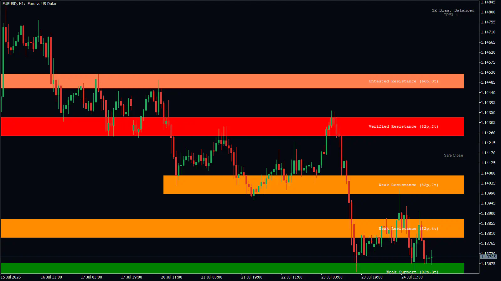
On the right end of each box is a label in small type, for example Verified Resistance (82p,2t). The first words are the zone’s class and side. The number before p is the zone’s height in points, the smallest price step your broker quotes. The number before t is how many separate times price touched the zone in the last 100 candles.
In the top-right corner there is one more line of text: SR Bias: Bullish, SR Bias: Bearish or SR Bias: Balanced. It compares how strong the support zones are near price against the resistance zones near price, and it is colored lime green, tomato red or silver to match.
You will not see a zone at every old turning point. The tool only draws a handful of zones on each side of price, and only those reasonably close to it, so the chart stays readable. On the 1-minute chart you get at most three per side; on higher timeframes the zones reach further from price, and the daily chart can show more of them.
How to read the zones
Start with the side. The rule is simple: a zone below the last closed price is support, and a zone above it is resistance. So when price crosses a zone, its label flips on the next candle. Yesterday’s support can be today’s resistance.
Then read the class. Each one has its own color on each side.
| Class | What it means | Resistance color | Support color |
|---|---|---|---|
| Verified | Touched recently, and close in strength to the strongest zone near price. | Red | Dark green |
| Weak | Touched recently, but not among the strongest. | Dark orange | Green |
| Untested | Price has not touched it in the last 100 candles. | Coral | Sea green |
| Turncoat | Price has crossed it; its latest swings came from the other side. | Orchid | Olive green |
- What it means
- Touched recently, and close in strength to the strongest zone near price.
- Resistance color
- Red
- Support color
- Dark green
- What it means
- Touched recently, but not among the strongest.
- Resistance color
- Dark orange
- Support color
- Green
- What it means
- Price has not touched it in the last 100 candles.
- Resistance color
- Coral
- Support color
- Sea green
- What it means
- Price has crossed it; its latest swings came from the other side.
- Resistance color
- Orchid
- Support color
- Olive green
Now, how a zone is made. The tool looks back over the last 3000 candles for swing highs and swing lows. A swing high is a candle whose high is the highest of the seven candles on each side of it; a swing low is the same idea turned upside down. Recent swings count more than old ones, and a swing that price left quickly and strongly counts more than one it drifted away from. Where many of those swings pile up at similar prices, you get a zone.
The height of each zone is scaled to how much price has been moving lately, measured with the average true range (ATR), that is, the typical size of a recent candle’s range. In a fast market the boxes are taller; in a quiet one they are thinner.
That swing rule has a cost. A swing only counts once seven more candles have formed after it, so a zone always appears a little after the turn that created it. That is why the MetaTrader 5 input calls this tool Supply & Demand (Lagging).
What the zones do not tell you matters too. They do not read volume or orders. They do not predict a bounce or confirm one. They show where price turned before, and nothing more. No tool wins every trade, and losing trades are part of trading with this one as well.
A walk-through on a real chart
Look at the EURUSD 1-hour chart above, from 15 to 24 July 2026. It was taken at the right-hand edge of the chart, on 24 July, so these are the zones as they stood that day.
The red box between about 1.1425 and 1.1433 is labeled Verified Resistance (82p,2t). Price spent 17 to 20 July trading inside it. Then, on 23 July, a spike rose to 1.1435, straight into the box, and price dropped sharply afterwards, about 70 pips. A pip is the standard small unit of price movement. That is what a first reaction at a red zone looks like.
Next, the orange box between about 1.1399 and 1.1406. From 20 to 22 July it acted as support: price bounced off it on 21 July. On 23 July price fell through it, and now that the box sits above price, it is labeled Weak Resistance (82p,7t). That is the role flip in action.
Below it, a second orange box around 1.1379 to 1.1387 did the same kind of job on 24 July. Rallies poked their wicks through it, but candles kept closing back underneath. And at the bottom, the green Weak Support box held the lows on 23 and 24 July.
If you were planning a trade from this picture, it would sound like this. A sell near the red zone would put its stop loss, the order that closes the trade if you are wrong, above the top of the box plus the spread. A sell from a flipped zone like the orange one would aim for the next support zone below.
Now the honest part. This chart was captured on 24 July, and the zones were built from the swings you can see in it, including the 23 July spike itself. So the picture shows what a zone reaction looks like. It does not prove the zone would have been there, in that exact place, before the spike happened.
How traders use it
Three setups showed up on real charts. Treat each one as a picture of what to look for, not as a result to expect.
The first is a first reaction at a Verified resistance zone. After a rally, price spikes into a red box and turns down. Besides the EURUSD 1-hour example above, the same shape appeared on the EURUSD 4-hour chart, where the 15 July high went into a Verified Resistance box and fell back into the range, and on the EURUSD 15-minute chart, where a spike on 24 July at 09:00 touched the lower edge of a Verified Resistance box and price fell about 30 pips. The stop goes above the top of the zone, plus the spread.
The second is the role-flip retest. A zone that held as support breaks. Price comes back up from below and stalls under it, now drawn as resistance. The stop goes above the zone, and the target is the next support zone below.
The third is trading a range between two zones. On a scrolled-back GBPUSD 15-minute chart from 21 to 22 July 2026, price sat for about 18 hours between two thin coral boxes, turning at the upper one and holding at the lower one. The idea is to sell near the top zone and buy near the bottom one, with stops beyond each box. Keep in mind that this was a scrolled-back window, so you cannot tell whether both zones existed at the time.
Tip: Give each zone a little room. Put your stop beyond the box plus the spread, not exactly on its edge.
Mistakes people make
Judging the tool on a scrolled-back chart. When you scroll back, you are not seeing the zones as they were then. You are seeing today’s zones, built from those very swings, so they line up with old turning points almost by definition. It will look perfect. It tells you nothing about how the zones would have helped you live.
Treating a Weak zone with many touches as a wall. On the EURUSD 4-hour chart, a Weak Resistance box with nine touches sat in the middle of the 3 to 22 July range, and price crossed it back and forth the whole time. A high touch count on a Weak zone means price keeps passing through, not that it keeps bouncing.
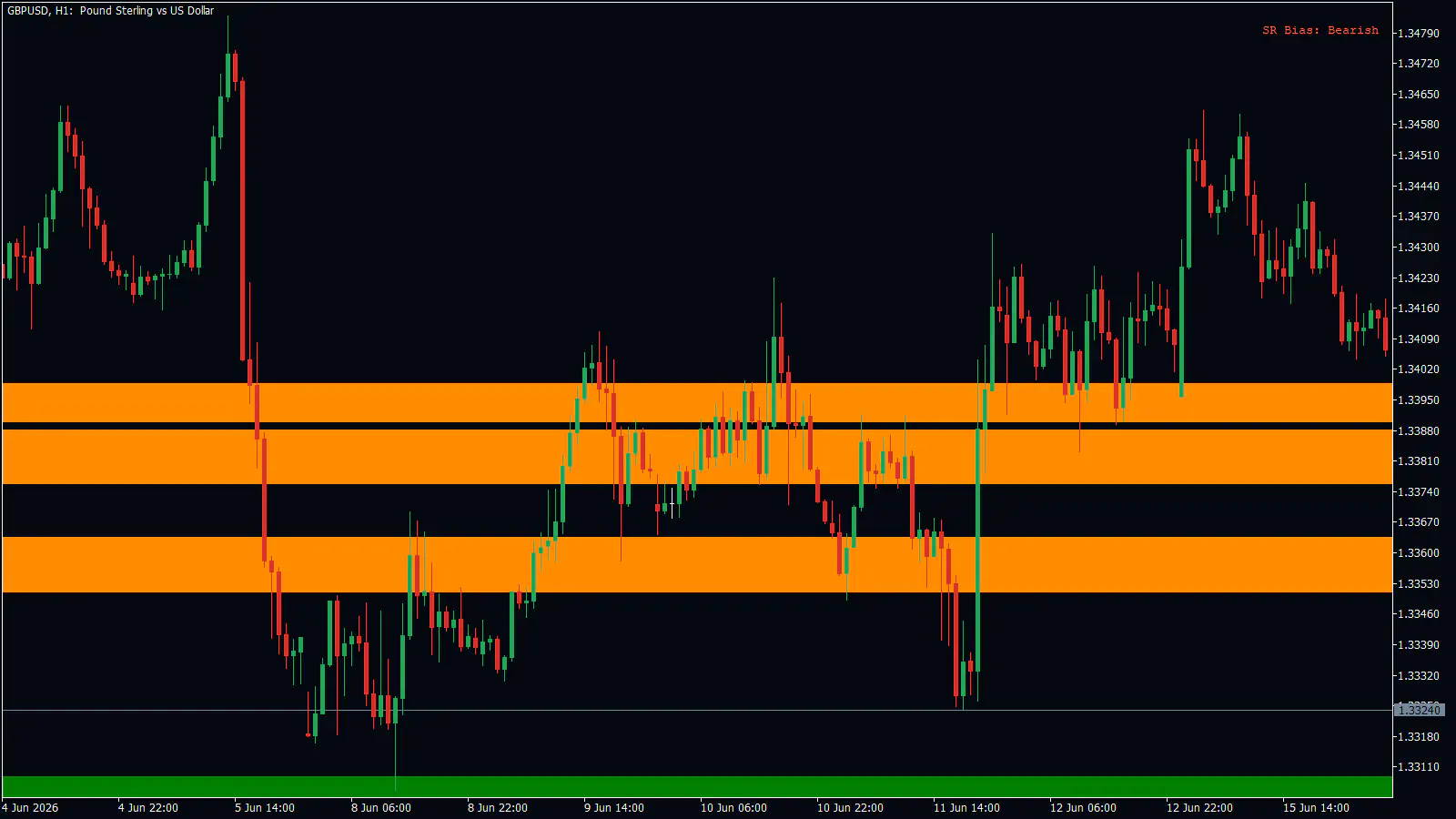
Trading a cluster of weak zones in a range. On the GBPUSD 1-hour chart above, three orange zones sat stacked between about 1.3350 and 1.3402 with small gaps between them. From 9 to 12 June price chopped through all three again and again, and the 11 June dip went through all of them and snapped back. There was no clean reaction to trade.
Putting the stop exactly on the zone edge. On EURUSD on 24 July (1-hour chart) and GBPUSD on 21 July (15-minute chart), wicks poked through a zone before the candle closed back inside. A stop sitting on the edge would have been hit.
Trusting “Untested” too much. Untested only means price has not touched the zone in the last 100 candles. On the EURUSD 1-hour and 15-minute charts, Untested zones sat where price had traded straight through them a few days earlier.
Assuming the map is complete. On the EURUSD 15-minute chart on 23 and 24 July, all three zones were above price and no support zone was drawn at all, even with price at its lows. No box below you does not mean nothing is below you.
Turning it on and setting it up
The tool is on by default. In the MetaTrader 5 inputs the switch is called Supply & Demand (Lagging), and it starts set to true.
- Open the indicator’s inputs and scroll to the group headed SUPPORT RESISTANCE. The main zone settings are there.
- Leave Use Density-Generated Zones switched on, in the SR DENSITY FIELD group. It is the default, and everything in this chapter describes it.
- Decide which classes to show with Show Verified, Show Weak, Show Untested and Show Turncoat. All four are on by default. If the chart feels busy, switching off Weak is a good first step.
- Switch on Show Alerts if you want to hear when price reaches a zone.
| Setting | What it does | When to change it |
|---|---|---|
| Total History | How many candles are scanned for swings. Default 3000. | Lower it on a slow computer. |
| Zone Future Bars | How far right of the newest candle the labels end. Default 3. | If labels overlap your price scale. |
| Fill Colors | Filled boxes, or outlines only. On by default. | Switch off if the boxes hide the candles. |
| Show Info | The name label, such as “Verified Support”. On by default. | Switch off for a cleaner chart. |
| Show Points | Adds the height and touch count, such as “(85p,2t)”. On by default. | Switch off if you do not use the numbers. |
| Show Verified / Weak / Untested / Turncoat | Shows or hides each class. All on by default. | To declutter. |
| Label Color / Font / Size | Label text: WhiteSmoke, Courier New, size 8. On a filled box the label color is picked automatically to stay readable. | If labels are hard to read. |
| Show SR Bias | The SR Bias text in the top-right corner. On by default. | Switch off if you do not use it. |
| Show Alerts | A touch alert. Off by default. | When you want to be called to the chart. |
- What it does
- How many candles are scanned for swings. Default 3000.
- When to change it
- Lower it on a slow computer.
- What it does
- How far right of the newest candle the labels end. Default 3.
- When to change it
- If labels overlap your price scale.
- What it does
- Filled boxes, or outlines only. On by default.
- When to change it
- Switch off if the boxes hide the candles.
- What it does
- The name label, such as “Verified Support”. On by default.
- When to change it
- Switch off for a cleaner chart.
- What it does
- Adds the height and touch count, such as “(85p,2t)”. On by default.
- When to change it
- Switch off if you do not use the numbers.
- What it does
- Shows or hides each class. All on by default.
- When to change it
- To declutter.
- What it does
- Label text: WhiteSmoke, Courier New, size 8. On a filled box the label color is picked automatically to stay readable.
- When to change it
- If labels are hard to read.
- What it does
- The SR Bias text in the top-right corner. On by default.
- When to change it
- Switch off if you do not use it.
- What it does
- A touch alert. Off by default.
- When to change it
- When you want to be called to the chart.
The alert fires when the current, still-forming candle reaches a zone that none of the previous three candles touched. The message names the zone, for example “Verified Resistance (120p,1t)”. Because it watches the forming candle, it can fire before that candle closes. It respects your show-class choices, so a hidden class never alerts. How the alert reaches you, as a popup, email or phone notification, is set by the global alert switches. The same message is not repeated within three candles.
Questions people ask
How often do the zones update? Once per new candle. Every zone is rebuilt from scratch each time. Nothing is tied to the trading sessions.
Can zones move, change or disappear? Yes. On each new candle a zone can shift, change class, switch between support and resistance, or vanish, either because it grew too faint or because price moved too far from it. Strong zones can vanish too.
Why does the switch say Supply & Demand (Lagging)? That is this tool’s name in the MetaTrader 5 inputs. A swing only counts once seven more candles have formed after it, so every zone arrives a little late.
Does it use volume or order flow? No. Only swing highs and lows in price, weighted by age and by how strongly price moved away from them.
Will it alert me when a zone breaks? No. The only alert is the touch alert described above.
Remember:
- Read the class, not just the color: a red Verified zone and an orange Weak zone deserve very different trust.
- Never judge the zones on a scrolled-back chart; those are today’s zones fitted to old swings.
- Leave room past the box for your stop, because wicks poke through.
The zones mark where price has turned before, and the next chapter, Action Levels, uses their centers as one of its ingredients to point at where price may react next.