You open a chart and you cannot tell which way it is leaning. Price pushes up for an hour, drops for two, and every candle seems to argue with the one before it. What you want is a quiet answer to one question: which side is in charge right now?
Signal lines give you that answer as a color. RelicusRoad Pro draws two moving lines on your price chart. Each one turns light green when its test says buyers are in control, light salmon when sellers are, and gray when the test says neither.
The lines do not pick entries for you. Their real job is to keep you on the right side of the market, and to tell you when to sit on your hands. The rest of this chapter shows you how to read them on your own chart.
What you see on your chart
You get two lines drawn right over the candles.
Signal Line 1 is thin and fast. By default it is a 9-period adaptive average (KAMA), one that speeds up when price moves steadily in one direction and slows down when price is choppy, so it hugs price closely and turns with it.
Signal Line 2 is thick and slow. By default it is a 200-period average. It sits further from price and bends only when the bigger move bends. In a strong trend on the 4-hour chart it can be 100 to 300 pips away from price.
Each line has three colors. The defaults are light green for uptrend, gray for neutral and light salmon (a pale pink-orange) for downtrend. The color is decided bar by bar and switches instantly. One bar is gray, the next is green, with a hard edge between them. There is no fading and no “stronger” or “weaker” shade.
How to read the colors
The most important thing to understand is this: the line’s position is always just the moving average. The color comes from a separate test, called the line’s strategy or mode. So the shape tells you where the average is, and the color tells you what the test thinks.
Light green means the test for that line reads bullish. Light salmon means it reads bearish. Gray means neither is true at the moment.
Gray is not a sideways-market detector. It only means the test found no clear side. Still, on real charts the gray stretches tend to cover the messy parts: the turn at the top or bottom of a move, and the flat base before the next leg.
And green is not an order to buy, just as salmon is not an order to sell. A color describes the bars that have just happened. It is a filter for direction, not a trigger.
The seven modes
Each line has its own Line 1 (Strategy Based) or Line 2 (Strategy Based) setting. It chooses the test that decides the color. The defaults are Momentum for Line 1 and Ichimoku for Line 2.
- MACD: green when the MACD line is above its signal line on the last closed bar, salmon when it is below. MACD is a common momentum tool, momentum meaning how fast and hard price is moving. Read more in our MACD guide.
- Reversal: looks at where the bar opens compared with a short 9-bar average, together with the shape of the previous candle.
- Trend: combines the MACD test with the Signal Cloud, a separate RelicusRoad feature covered in its own chapter.
- ParabolicSAR: green when the bar opens above the Parabolic SAR, salmon when the bar’s high stays below it. The SAR dots themselves are not drawn; only the color uses them.
- Momentum: compares the 5-bar momentum of the last closed bar with the value two bars earlier. Rising gives green, falling gives salmon.
- Ichimoku: green when the fast Ichimoku line is above the slow one and the last close sits above the Ichimoku cloud. Salmon is the mirror image. The Ichimoku guide explains the cloud.
- Moving Average: green when the bar opens above the signal line itself, salmon when it opens below.
There is also Disable, which keeps the line on the chart but always gray.
A walk-through: one trend on GBPUSD
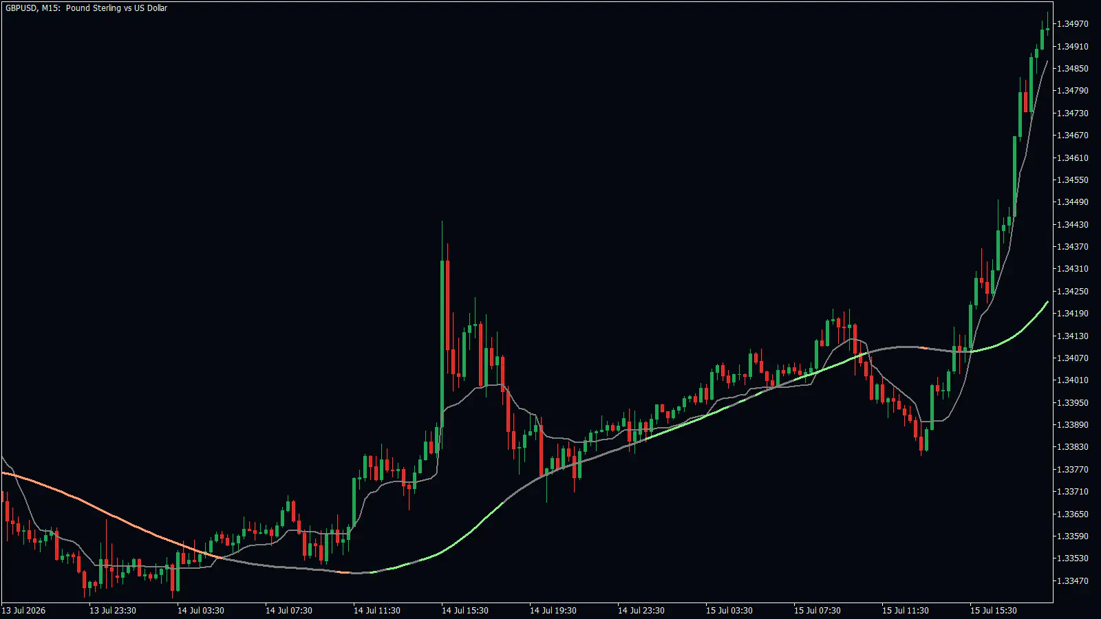
Look at the GBPUSD 15-minute chart above, from 13 to 15 July 2026. Follow the thick line, Signal Line 2.
On 13 July the line is salmon and sits above price. Sellers are in control, so a buyer has no business here yet.
Early on 14 July, from about 04:00 to 11:00, the line goes gray while price starts to lift. That gray is the tool saying “no clear side”. This is the moment to wait, not to guess.
At about 11:30 on 14 July the line turns green near 1.3350, and it keeps rising under price. Now your bias is up. You look only for buys, and you ignore sell ideas while the line stays green and price stays above it.
On 15 July price pulls back. Between about 08:00 and 14:00 the line goes gray again, and price dips a little under it, to about 1.3385. A careful trader waits here too. At about 15:00 the line turns green again, and price climbs to about 1.3497.
Where would a stop go? Beyond Signal Line 2, or beyond the last swing low on the other side of it. That keeps you in the trade while the trend holds, and gets you out if the picture really changes.
This is one chart, not a promise. The same reading will fail on other days. No tool wins every trade, and losing trades are a normal part of trading.
How traders use the lines
Three uses showed up clearly on the charts we studied.
The first is trend bias. You trade only in the direction of Signal Line 2’s color, and only while price is on the matching side of it. On a EURUSD 15-minute chart on 23 July 2026, the line turned salmon at about 09:45 near 1.14225, and price then fell about 55 pips over the next seven hours.
The second is the pullback. When price comes back to a green or salmon line and holds there, on the charts studied, the trend carried on. That is where you look for your entry, using price action such as a clear bounce from support and resistance.
The third is simply staying out while the line is gray. In our charts that kept a trader away from the choppy turns. The cost is real, though: you often miss the first part of the new move.
You can also try the other modes on your own charts, for example MACD or Moving Average on Line 1. We have not tested those on real charts for this manual, so treat them as experiments on a demo account first.
When both lines show the same color, you have confluence: two readings agreeing. That can make a bias feel more solid, but agreement is not proof. The strategy guides show full trade plans built on readings like these.
Mistakes people make
Expecting the color to be early. The color often changes well after price has crossed the line. On a EURUSD 4-hour chart in January 2026, the line turned green about three days and about 150 pips after price had crossed above it. On a GBPUSD 1-hour chart on 15 June 2026, price closed below the line while it was still green. Use the color for direction and let price tell you when.
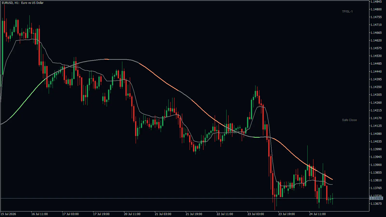
Trading a quick poke through the line. In the chart above, price spiked on 23 July to about 1.14355. Under the spike the line briefly went gray and then green. Within hours it turned salmon again, and price fell to about 1.13670. That short push and the brief green were a trap here, not a turn.
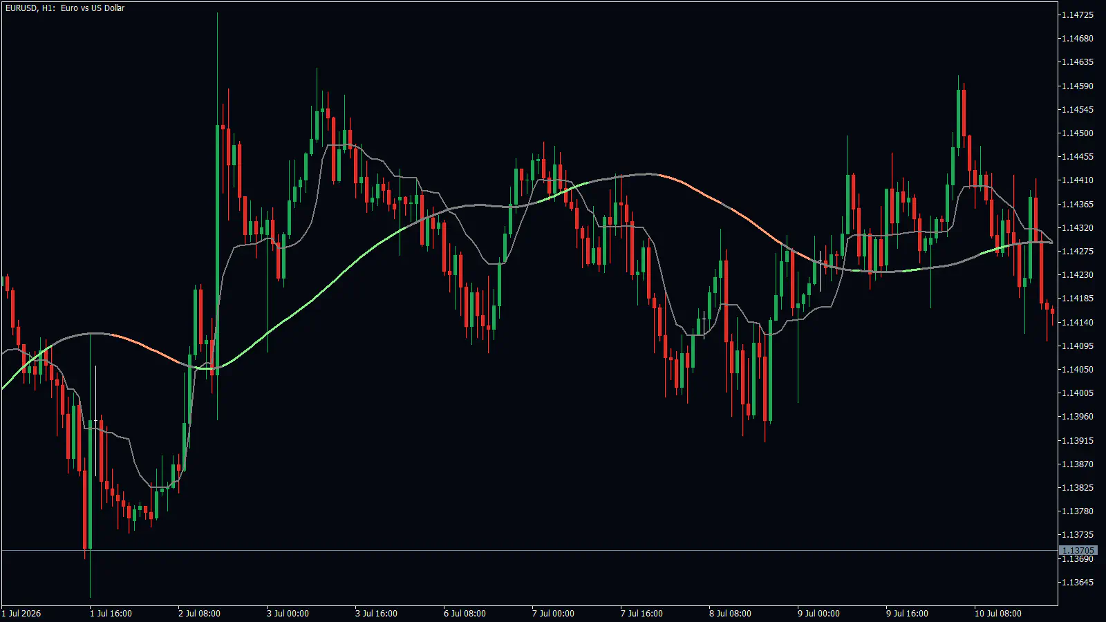
Following the colors in a range. When price moves sideways, the line flips back and forth. On the EURUSD 1-hour chart below, from 1 to 10 July 2026, it went salmon, green, salmon and green again inside one range. Each color was followed by a move the other way within a day or two. If price keeps crossing the line in both directions, treat the color as noise.
Acting on a blip. Sometimes a line changes color for just one to three bars and then changes back. Those blips are not signals.
Placing a huge stop without noticing. On the 4-hour chart, a stop beyond Signal Line 2 can be more than 100 pips away. Trade a smaller size, or take your entry on a lower timeframe.
Turning it on and setting it up
- Open the indicator settings. In the admin group, check that Signal Line 1 (Strategy Based) and Signal Line 2 (Strategy Based) are switched on. Both are on by default.
- For each line, choose the average in Line 1 Type/Mode or Line 2 Type/Mode. The defaults are KAMA for Line 1 and HMA for Line 2. The other choices are SMA, EMA, SMMA, LWMA, VIDYA and FRAMA, which are simply different ways of averaging price.
- Set Line 1 Length and Line 2 Length. A shorter length reacts faster; a longer one is smoother. The defaults are 9 and 200.
- Pick each line’s test in Line 1 (Strategy Based) and Line 2 (Strategy Based). Start with the defaults, Momentum and Ichimoku, before you experiment.
- If you want a message when a line turns, switch on Line 1 Alerts or Line 2 Alerts. They are off by default. Popup, email, mobile and sound delivery follow the shared alerts settings.
| Setting | What it does | When to change it |
|---|---|---|
| Line N Length | How many bars the average covers | Shorter to follow price closely, longer for a calmer background line |
| Line N (Strategy Based) | The test that decides the color | When you want the color to follow a different idea, such as MACD |
| Line N Uptrend / Neutral / Downtrend Color | The three colors | If the defaults are hard to see on your chart |
| Line N History | How many recent bars are calculated (default 3000) | Rarely needed; the maximum is 5000 |
- What it does
- How many bars the average covers
- When to change it
- Shorter to follow price closely, longer for a calmer background line
- What it does
- The test that decides the color
- When to change it
- When you want the color to follow a different idea, such as MACD
- What it does
- The three colors
- When to change it
- If the defaults are hard to see on your chart
- What it does
- How many recent bars are calculated (default 3000)
- When to change it
- Rarely needed; the maximum is 5000
Questions people ask
What do the three colors mean? Light green means the line’s mode reads bullish. Light salmon means it reads bearish. Gray means neither is true right now. It often shows at turning points and flat stretches, but it is not a special sideways detector.
Is Line 1 more important than Line 2? No. Both run the same code and have the same settings. Line 1 simply starts as a fast 9-period line near price, and Line 2 as a slow 200-period line further away.
When do the colors change, and when do alerts fire? A new color is worked out once per bar, when the bar opens, and the switch is instant. Alerts are off by default. Switched on, they tell you when a line turns to uptrend or downtrend, at the start of the bar after the change. There is no alert for gray or for price crossing a line.
Does the color tell me exactly when to enter? No. It often arrives after price has already crossed the line. Use it for direction, and time the entry with price.
Remember: The line’s position is the average; its color is the test. Trade in the direction of the color, and wait while it is gray. Expect the color to be late, and stop trusting it when price chops back and forth across the line.
The signal lines tell you which way the market leans; the next chapter, Daily Highs & Lows, adds fixed levels from the previous day, week or month, to sit alongside the round-number grid from Action Levels.