You open a chart in the morning and price is sitting somewhere in the middle of the screen. Is that high or low? Near a place where it turned before, or out in open space? Without some fixed reference points, every price looks the same.
The Daily High/Low/Open tool gives you three of those reference points. It marks where price topped out and bottomed out in the last finished period, and where the current period opened. On the real charts behind this chapter, price often reacted when it came back to one of them.
There is one thing to learn before anything else, because it is easy to miss. Despite the name, the lines are not always about yesterday. Which period they show depends on the chart you are looking at, and this chapter starts there.
What you see on your chart
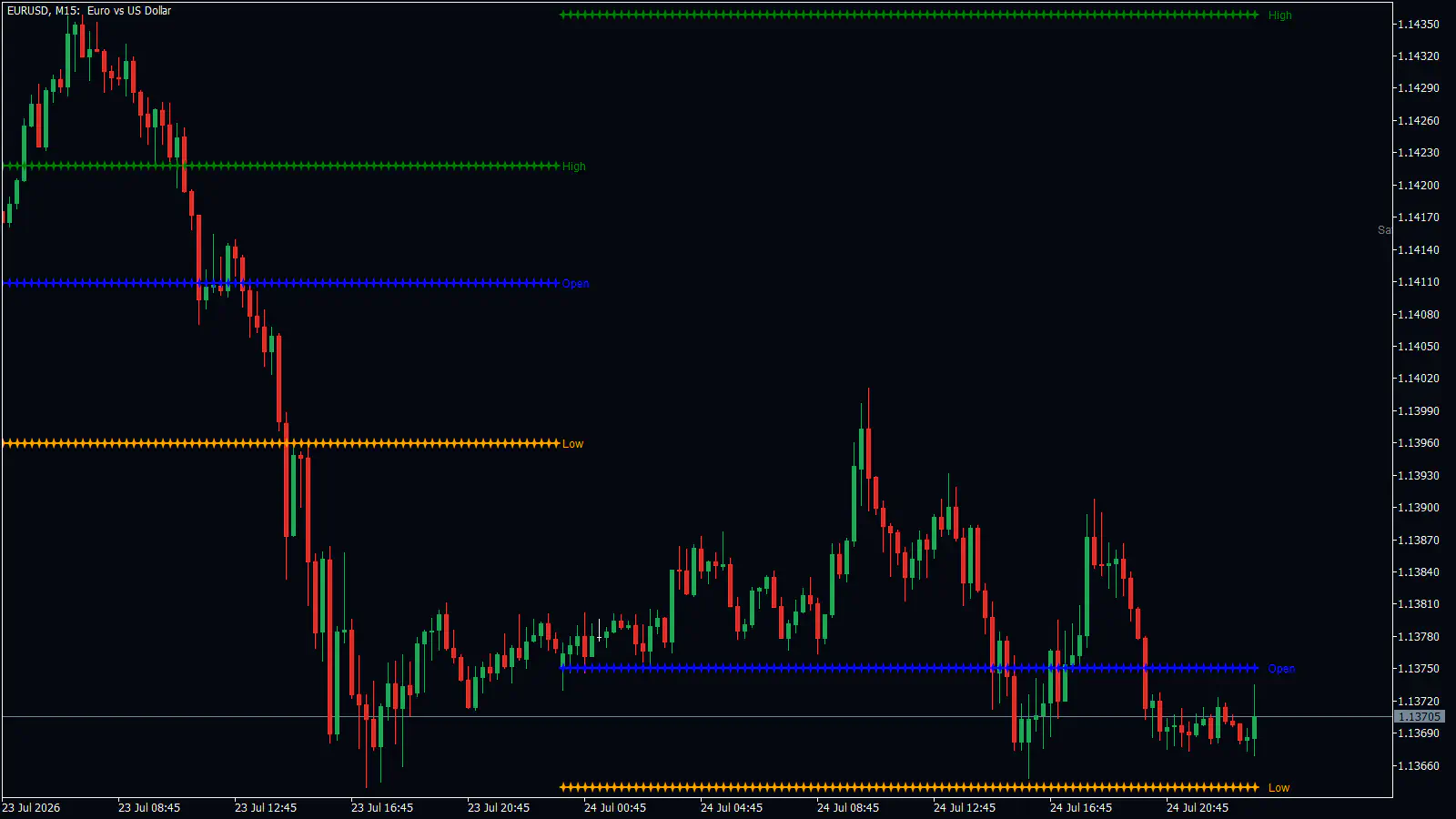
Each level is drawn as a row of small “+” crosses, one cross per candle, so it looks like a dotted horizontal line. There are three rows:
- Green is the High: the highest price of the previous period.
- Orange is the Low: the lowest price of the previous period.
- Blue is the Open: the price where the current period started.
Each row stays flat for the whole period, then steps to a new price when the next period begins. So across a few days of history you see a staircase of short flat lines rather than one long one. At the end of each period, and again just to the right of the newest candle, you see a small text label in the same color: “High”, “Low” or “Open”.
The past steps stay on the chart. You can scroll back and see the levels for earlier periods, each one labelled, as far back as the Bar History setting allows (3000 candles by default).
Which period the lines belong to
This is the surprise. The tool chooses its period from the chart’s timeframe, meaning how much time one candle covers:
| Chart you are on | The High and Low come from | The Open is |
|---|---|---|
| 1-minute up to 30-minute | the previous day | today’s open |
| 1-hour up to 4-hour | the previous week | this week’s open |
| Daily | the previous month | this month’s open |
| Weekly and above | nothing is drawn | nothing is drawn |
- The High and Low come from
- the previous day
- The Open is
- today’s open
- The High and Low come from
- the previous week
- The Open is
- this week’s open
- The High and Low come from
- the previous month
- The Open is
- this month’s open
- The High and Low come from
- nothing is drawn
- The Open is
- nothing is drawn
So on the 15-minute chart, the green line is yesterday’s high. Switch the same symbol to the 1-hour chart and the green line jumps to a very different price, because now it is last week’s high. Nothing is broken. You are simply looking at a different period.
A “day” here is your broker’s day. It starts and ends at midnight on the broker’s server clock, not at midnight where you live, and the tool does not adjust for time zones or trading sessions.
How to read the three lines
The High and the Low are finished numbers. That period is over, so they will not change. Think of them as the edges of the last period’s range, the stretch of prices the market covered. When price comes back to one of those edges, the question is simple: does it stop there, or does it push through?
The Open works differently. It is where the current period began, so it tells you who has been winning so far. If price is above the Open, buyers have pushed it up since the period started. Below the Open, sellers have. On the charts studied for this chapter, days when price stayed on one side of the Open all day tended to trend in one direction. Days when price kept crossing back and forth over the Open were sideways days.
What the lines do not mean matters just as much. The green High is not today’s running high. It is the previous period’s high, even while today’s candles climb above it. And none of the lines is a signal to buy or sell by itself. They show you where to pay attention, not what to do.
A walk-through on a real chart
Look again at the EURUSD 15-minute chart above, from 23 July 2026. The day opened with price just above the green line, yesterday’s High, at about 1.1422.
At 08:30 price dropped back under that High. That was the first clue: the buyers could not hold price above yesterday’s top. Price then fell through the blue Open at about 1.1411. Now price was below where the day started, so sellers were winning the day.
Around 15:00 price broke through the orange line, yesterday’s Low at about 1.1396, and closed below it. This is the “break and go” traders look for. Price was already on the sellers’ side of the Open when it broke the Low, and it kept falling about 30 more pips, down to 1.1366.
The next day shows the other side of the story. On 24 July the new orange Low sat at about 1.1366, the bottom of 23 July. Price came down to it twice, at 13:30 and again at 23:00, and both times it held. Meanwhile price crossed the new Open at about 1.1375 back and forth all day. That is what a sideways day looks like on this tool.
This is one chart, told after the fact. The same patterns fail often enough that you should expect some of them to fail on you. No tool wins every trade, and losses are part of trading.
How traders use these levels
These are the patterns that showed up on the real charts behind this chapter.
Break and go. Price closes beyond the previous High or Low while it is already on the same side of the Open. That filter, price above the Open for a break upward or below it for a break downward, helped on the charts studied here. On the GBPUSD 15-minute chart on 15 July 2026, price broke the previous day’s High at about 17:00 and ran about 55 pips higher.
The first touch as a barrier. Price comes back to the previous Low or High, and the first touch holds. Traders who take this put the stop loss (the price where you accept you were wrong and close the trade) beyond the level by about the size of a normal candle wick, and aim for the Open. The EURUSD Low on 24 July is an example.
Break, retest, reject. A level breaks, price comes back to it from the other side, and it pushes price away again. The broken level has switched roles: an old floor now acts as a ceiling. The stop goes back beyond the level by a wick’s size.
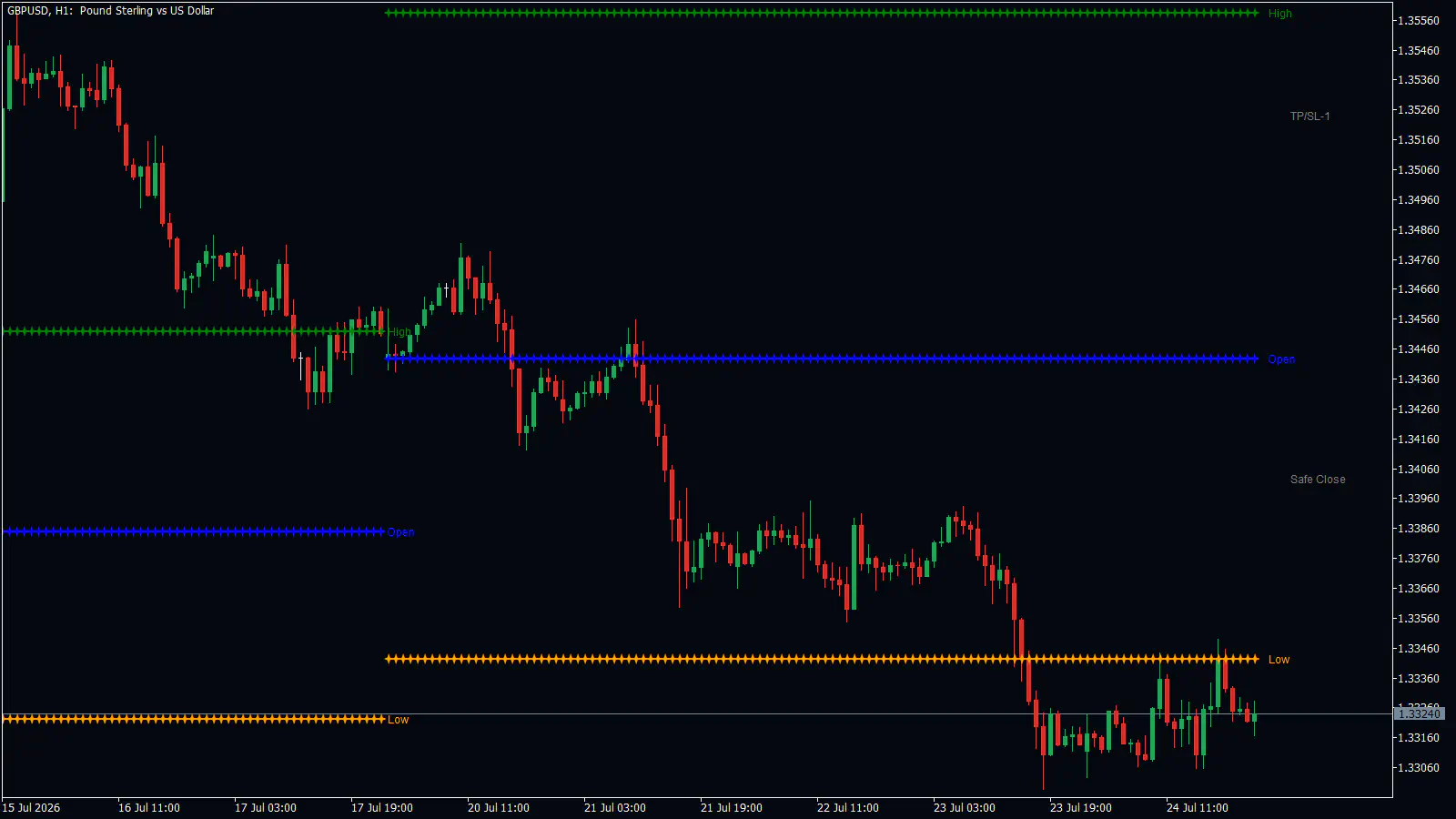
On this GBPUSD 1-hour chart the lines are weekly, so every level stays flat across the whole week. On 21 July price rallied up to the weekly Open at about 1.3443 from below, was turned away at about 1.3450, and then fell about 100 pips. On 23 July it broke the previous week’s Low at about 1.3343 and stayed under it. On 24 July at 14:00 a wick reached back up to that broken Low and was pushed away.
The same patterns showed up on the 4-hour chart, where the levels are weekly too. On GBPUSD in the week of 29 June 2026, price held above the weekly Open and then broke the previous week’s High on 2 July.
Mistakes people make
Reading weekly levels as daily ones. On the 1-hour and 4-hour charts the lines show the previous week, not the previous day. If you expected yesterday’s high and read the green line on a 1-hour chart, you are trading the wrong number. Check which chart you are on before you use a level, or set the period yourself (see the setup steps below).
Trusting every break. Price often pokes through a High or Low and comes straight back. Of the 9 breaks counted on the charts for this chapter, a small sample, 3 came back inside. Wait for a candle to close beyond the level rather than reacting to a spike.
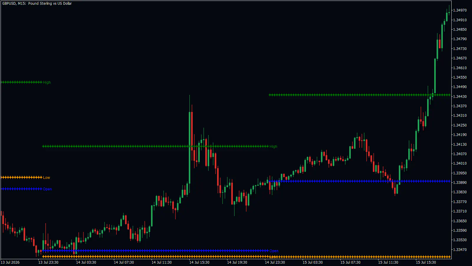
On 14 July, the 15:30 spike on this chart broke the previous day’s High at about 1.3413, reached 1.3444, and was back under the line within two candles. Price then dropped to about 1.3375. Compare the next day: on 15 July price was holding above the Open, broke the new High at about 1.3443, and ran to about 1.3500.
Trading the Open when price keeps crossing it. When price crosses the Open again and again, there is no side in control. On EURUSD in the week of 6 July 2026, price crossed the weekly Open about 10 times. That week was a range, not a trend, and the Open had no side to show you.
Expecting the lines to update during the day. They do not. The High and Low belong to a period that has already closed, and the Open is set when the new period starts. If you want the live high of today, look at the candles, not the green line.
Turning it on and setting it up
- Open the RelicusRoad Pro settings and make sure Daily High/Low Levels (Leading) is on. It is on by default.
- Look at which chart you are on and check the table above, so you know whether you are seeing day, week or month levels.
- If you want the previous day’s levels on a 1-hour or 4-hour chart, open the DAILY HIGH LOW OPEN group and change Timeframe from current to D1. The tool then uses the day on any chart.
- Change the colors or widths only if the lines are hard to see against your chart.
The settings live in the group called DAILY HIGH LOW OPEN. The same options are also in the in-chart panel.
| Setting | What it does | When to change it |
|---|---|---|
| Timeframe | The period the lines come from. The default, current, picks it from the chart (see the table above). | When you want a fixed period, such as daily levels on a 1-hour chart. |
| Bar History | How many candles back the levels are drawn. Default 3000. | Lower it if you only care about recent periods. |
| Show High / Show Low / Show Open | Show or hide each row. All on by default. | Hide a row to clean up a busy chart. |
| High Color / Low Color / Open Color | Green, orange and blue by default. | If a color clashes with your chart. |
| High Width / Low Width / Open Width | Size of the crosses. Default 1. | If the rows are too faint to see. |
- What it does
- The period the lines come from. The default, current, picks it from the chart (see the table above).
- When to change it
- When you want a fixed period, such as daily levels on a 1-hour chart.
- What it does
- How many candles back the levels are drawn. Default 3000.
- When to change it
- Lower it if you only care about recent periods.
- What it does
- Show or hide each row. All on by default.
- When to change it
- Hide a row to clean up a busy chart.
- What it does
- Green, orange and blue by default.
- When to change it
- If a color clashes with your chart.
- What it does
- Size of the crosses. Default 1.
- When to change it
- If the rows are too faint to see.
For the full list of every RelicusRoad Pro option, see the settings reference.
Questions people ask
Why do the lines show different prices on the 15-minute and the 1-hour chart? Because the period comes from the chart. Below the 1-hour chart it is the previous day, from the 1-hour to the 4-hour chart it is the previous week, and on the daily chart it is the previous month. On the weekly chart and above nothing is drawn.
Is the blue line a midpoint? No. It is the open of the current period, the price where the current day, week or month started. There is no midpoint line.
Do the lines move during the day? No. They stay flat for the whole period and step to new prices when the next period begins.
Can I see the previous day’s levels on a 1-hour chart? Yes. Set Timeframe in the DAILY HIGH LOW OPEN group to D1.
Whose day does the tool use? Your broker’s. The day runs from midnight to midnight on the broker’s server clock, with no adjustment for your time zone or for trading sessions.
Remember: Check your chart first: below 1-hour the lines are the previous day, from 1-hour to 4-hour they are the previous week, and on the daily chart the previous month. The blue line is the current period’s open, and which side of it price is on tells you who is winning. Wait for a close beyond a High or Low, because many breaks come straight back.
In the next chapter, Daily Pivots, you add a second set of fixed levels to sit alongside these three lines.