You look back at a chart and the swings are obvious. There is the top, there is the bottom, there is where the trend turned. But in the moment, while the candles are forming, you cannot tell a real top from a pause.
Fractal Arrows mark those swings for you. A swing high is a candle whose high is higher than the candles around it, and a swing low is the mirror of that. The tool puts a small arrow on each short swing and a large arrow on each bigger one, so the shape of the market, its structure, is easy to see.
There is a price for that clarity, and you need to understand it before anything else. Every arrow appears late, several candles after the swing is over. The whole chapter is built around using the arrows well despite that delay.
What you see on your chart
The arrows sit right on the tips of the candle wicks.
- A red arrowhead pointing up sits on the tip of a swing high.
- A green arrowhead pointing down sits just under the tip of a swing low.
So the arrows point away from price, up at the tops and down at the bottoms. Each one sits on the exact candle that made the extreme, never on a neighbor.
There are two sizes. A small arrow is a fast fractal, a short swing. A large arrow is a slow fractal, a bigger swing. A slow swing is almost always a fast swing too, so a big arrow usually has a small one on the same wick, and together they read as one fat arrow.
On the charts studied for this chapter, small arrows showed up roughly every 8 to 20 candles and large arrows every 20 to 60, on the 15-minute, 1-hour and 4-hour charts alike.
How to read the arrows
Fast and slow are not two timeframes. Both come from the chart you are looking at. They are two sizes of swing on the same candles:
- A fast arrow means that candle’s high (or low) was the most extreme of the 7 candles on each side of it.
- A slow arrow means it was the most extreme of the 15 candles on each side.
That is why slow arrows matter more for structure. A slow high is a top that held for 15 candles either way. A fast high may be nothing more than a small wobble inside a range.
Read the arrows in sequence. Slow highs that keep getting lower, with slow lows that keep getting lower too, describe a falling market. Rising slow lows describe a rising one. The tool does not label this for you. You read it by comparing one arrow to the last one of the same color.
What an arrow does not mean matters too. It is not a signal to sell at the top or buy at the bottom. By the time it appears, that top or bottom is long gone.
Why every arrow is late
To know that a candle was the highest of the 7 candles on its right, the tool has to wait for those 7 candles. So a fast arrow appears 7 candles after the swing. A slow arrow needs 15 candles, so it appears 15 candles after the swing. When it does appear, it is drawn back on the swing candle, so looking at history it seems to have been there all along.
In real time, that delay looks like this:
| Chart | A fast arrow appears after | A slow arrow appears after |
|---|---|---|
| 15-minute | about 1 hour 45 minutes | about 3 hours 45 minutes |
| 1-hour | about 7 hours | about 15 hours |
| 4-hour | a bit over a day | about 2 and a half days |
- A fast arrow appears after
- about 1 hour 45 minutes
- A slow arrow appears after
- about 3 hours 45 minutes
- A fast arrow appears after
- about 7 hours
- A slow arrow appears after
- about 15 hours
- A fast arrow appears after
- a bit over a day
- A slow arrow appears after
- about 2 and a half days
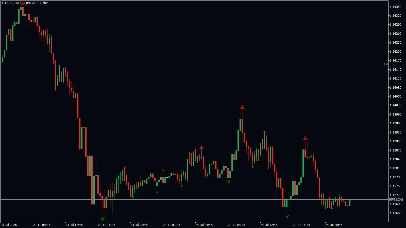
Look at the right edge of this EURUSD chart. The newest arrow, a small green one near 21:00 on 24 July, sits about 9 candles before the last candle. Price made a fresh low in the last few candles, and there is no arrow on it. There cannot be one yet. That empty space on the right is always there, on every chart.
A brand-new fast arrow can also vanish one candle later, if the newest candle runs past that swing. After that it stays. Arrows on older candles never move.
So plan around the delay. Use the arrows to mark levels, the price of the last swing high and the last swing low, and to decide where a stop loss belongs (the price where you accept you were wrong and close the trade). Do not wait for an arrow to tell you a top is in right now.
A walk-through on a real chart
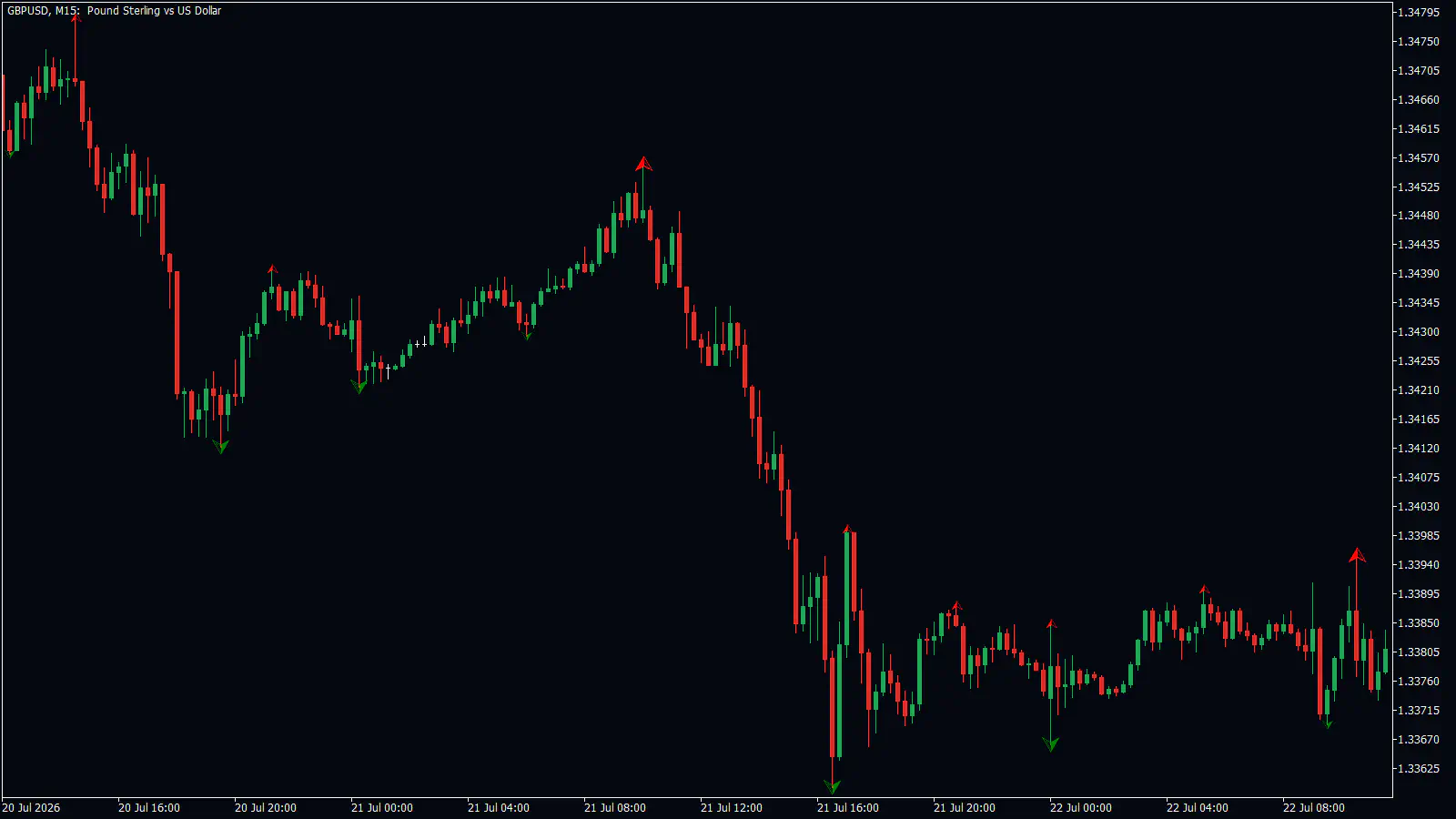
On this GBPUSD 15-minute chart from July 2026, the story starts on 20 July. A large green arrow marks a slow low at about 1.3415 around 18:30. Early on 21 July, around 00:30, another large green arrow marks a slow low at about 1.3421. That second low is higher than the first, so for now buyers are holding up.
Price rises into a slow high at about 1.3457 around 09:30, marked by a large red arrow. The candles showed that high as it happened. The arrow itself could only arrive 15 candles later, close to 13:15.
Around 13:00 price breaks down through both slow lows, 1.3421 and 1.3415. That is a break of structure, meaning the pattern of higher lows has failed. A trader who sold that break would put the stop above the 1.3457 slow high, about 35 to 40 pips away.
Price fell to a slow low at about 1.3363 around 16:00, roughly 55 pips in about 3 hours. Then it stopped trending and moved sideways between about 1.3365 and 1.3400, with small arrows flipping from top to bottom every few candles. The slow low near 1.3367 around midnight going into 22 July sat almost level with the 16:00 low, a double bottom, meaning two lows at nearly the same price.
This is one chart, told after the fact. The next break of structure you trade may go nowhere, or reverse. No tool wins every trade, and losses are part of trading.
How traders use the arrows
These are the patterns that showed up on the real charts behind this chapter. In each one, the arrows mark the level, and the trade happens when price closes beyond it.
Break of a slow low in a falling market. On the EURUSD 1-hour chart, slow highs kept getting lower from 17 to 21 July 2026. On 23 July price closed below the latest slow low at about 1.1397. The stop would sit above the last slow high at about 1.1436, about 40 pips. Price fell to about 1.1367, roughly 30 pips, and then went sideways. The move was smaller than the stop, so a trader there would have needed to trail the stop above each new fast high.
Break of a slow high in a rising leg. This works the same way in the other direction.
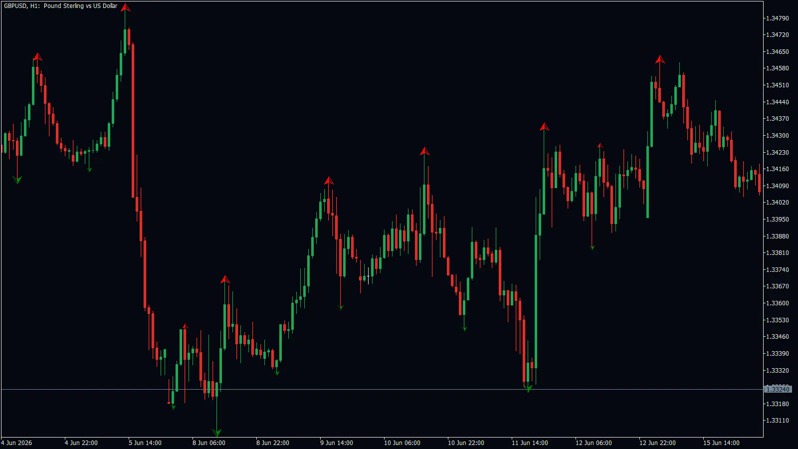
On this GBPUSD 1-hour chart, price closed above the 8 June slow high at about 1.3365 on 9 June. The stop would go below the 8 June slow low at about 1.3310, about 55 pips. Price climbed to about 1.3410, then 1.3425.
Range break. On the EURUSD 4-hour chart, price moved sideways from late April to 12 May 2026, leaving several slow highs and slow lows. Around 13 to 14 May it closed below the lowest slow low of that range, about 1.1655. The stop would go above the last slow high at about 1.1785, some 130 pips away. The move ran to the 20 May slow low at about 1.1585, about 70 pips, so here too the stop was bigger than the move.
Double tops and bottoms. Two slow arrows at almost the same price can mark a turn. On EURUSD 15-minute on 15 July 2026, two highs at about 1.1440 and 1.1442 were followed by a 35-pip drop. The double bottom in the walk-through above led only to a sideways range. So this pattern tells you where price stalled, not how far it will go.
Mistakes people make
Treating an arrow as an entry at the turn. A fast arrow is 7 candles late and a slow one 15. By the time a red arrow appears, price may already be far below the top. Use the arrow as a level to trade a break from, not as a signal to sell the high.
Trusting small arrows as stop levels. On the GBPUSD 1-hour chart above, on 11 June price broke through the small green lows around 1.3350 to 1.3360, dipped to about 1.3325, then rallied about 100 pips. The large 8 June low at about 1.3310 held. A stop under the small arrows was taken out right before the move.
Holding a breakout that has already turned. On GBPUSD 4-hour, price closed above the 9 July slow high at about 1.3460 on 14 to 15 July 2026 and spiked to about 1.3560. Within a week the whole move was gone and price fell below the 13 July slow low. A trader with no plan to take profit at the spike lost on that trade.
Expecting every break to run. On EURUSD 15-minute, a break of the 14 July slow low at about 1.1417 gave about 12 pips to 1.1405, then price shot straight back up through the break level. Some breaks have almost no follow-through.
Trading the chop. When small red and green arrows alternate every few candles, as on GBPUSD 15-minute after 16:00 on 21 July, the market has no direction. You can also try ignoring the small arrows in a stretch like that and watching only the large ones, or only trading in the direction of the last two slow highs and lows.
Turning it on and setting it up
- Open the RelicusRoad Pro inputs and turn on Fractal Arrows. It is off by default, so you will see no arrows until you do this.
- Leave the ranges at their defaults to start, so the delay matches this chapter: 7 candles for fast arrows, 15 for slow.
- If the chart is too busy, hide the fast arrows with Show Fast High and Show Fast Low, and keep the slow ones.
- If you want a message when a new swing is confirmed, turn on Show Alerts in the FRACTALS group.
The settings sit in the group called FRACTALS.
| Setting | What it does | When to change it |
|---|---|---|
| Fast High Range | Size of the fast swing. Default 3, which means 7 candles on each side. It applies to both highs and lows, despite the name. | A bigger number needs a bigger swing and adds more delay. |
| Slow High Range | Size of the slow swing. Default 6, which means 15 candles on each side. Also applies to highs and lows. | Same trade-off as above. |
| Show Fast High / Show Fast Low / Show Slow High / Show Slow Low | Show or hide each of the four kinds of arrow. All on by default. | Hide the fast ones on a busy chart. |
| Fast High Color / Fast Low Color / Slow High Color / Slow Low Color | Red for highs and green for lows by default. | If a color is hard to see. |
| Fast High Size / Fast Low Size / Slow High Size / Slow Low Size | Arrow size. Default 1 for fast and 3 for slow. | If the arrows are too small to spot. |
| History | How many candles back arrows are drawn. Default 3000. | Lower it if you only need recent swings. |
| Show Alerts | Alerts when a new swing is confirmed. Off by default. | Turn it on if you do not watch the chart all the time. |
- What it does
- Size of the fast swing. Default 3, which means 7 candles on each side. It applies to both highs and lows, despite the name.
- When to change it
- A bigger number needs a bigger swing and adds more delay.
- What it does
- Size of the slow swing. Default 6, which means 15 candles on each side. Also applies to highs and lows.
- When to change it
- Same trade-off as above.
- What it does
- Show or hide each of the four kinds of arrow. All on by default.
- When to change it
- Hide the fast ones on a busy chart.
- What it does
- Red for highs and green for lows by default.
- When to change it
- If a color is hard to see.
- What it does
- Arrow size. Default 1 for fast and 3 for slow.
- When to change it
- If the arrows are too small to spot.
- What it does
- How many candles back arrows are drawn. Default 3000.
- When to change it
- Lower it if you only need recent swings.
- What it does
- Alerts when a new swing is confirmed. Off by default.
- When to change it
- Turn it on if you do not watch the chart all the time.
If you picked a different Colour palette for RelicusRoad Pro and left these colors alone, highs take that palette’s bearish color and lows its bullish color.
Alerts arrive with the arrow, so they are late too: 7 or 15 candles after the swing. They read “Fast High Fractal”, “Fast Low Fractal”, “Slow High Fractal” or “Slow Low Fractal”. They also need the main alert switches (Show Alerts, Show Popup Messages, Send Email Notifications, Send Mobile Notifications), which are on by default.
Questions people ask
Why does the arrow not appear at the top while it is happening? Because the tool has to wait for candles on the right side of the swing. A fast arrow appears 7 candles later and a slow arrow 15 candles later, then it is drawn back on the swing candle.
Are the fast and slow arrows two different timeframes? No. Both come from the chart you are on. They are two sizes of swing: 7 candles on each side for fast, 15 for slow.
What do the colors and directions mean? A red arrowhead pointing up marks a swing high. A green arrowhead pointing down marks a swing low. Small is fast, large is slow.
Can an arrow disappear? A brand-new fast arrow can vanish one candle later if the newest candle runs past that swing. After that it stays, and older arrows never move.
Why can I not see any arrows? The tool is off by default. Turn on Fractal Arrows in the RelicusRoad Pro inputs.
Remember: Every arrow is late, 7 candles for a small one and 15 for a large one, so use arrows to mark levels and stop places, never to catch the turn. Large arrows matter more than small ones. And a break beyond a swing level still needs a plan for when it turns back.
In the next chapter, Market Sessions, you add time to the picture by marking the main trading sessions on your chart.