
What It Does
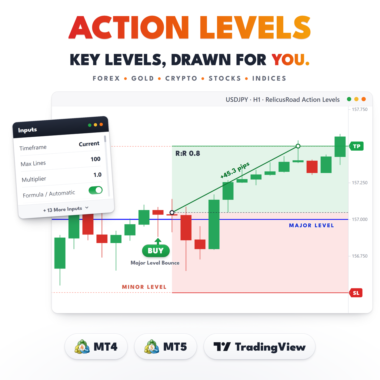
Most level indicators start from the decimal point. They draw a line every 50 pips, or at every round hundred, and hope the market cares. RelicusRoad Action Levels starts from the chart instead.
It reads the symbol’s own completed bars, finds the prices where the market turned or stalled, and fits a grid of evenly spaced levels to those reactions. The spacing comes from the instrument’s typical bar range and from the distance between reactions, not from a pip count you had to guess. Every line that survives carries a small label with the number of separate times price has come back to it.
What you get is a short list of prices that matter right now, at most fourteen of them, grouped around
the last close. No zones, no arrows, no panel.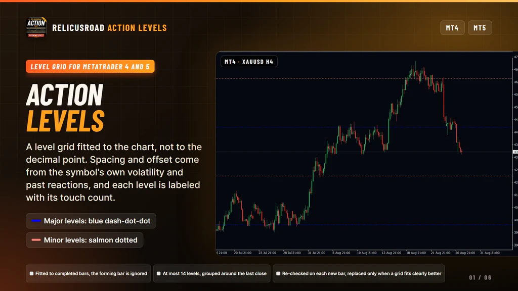
How It Works
In the default Formula mode the indicator works through four steps every time a bar completes.
- Collect the reactions. It reads up to 1,200 completed bars of the selected timeframe and notes swing highs, swing lows and bars with long upper or lower wicks. The bar still forming is ignored.
- Try grids. Candidate spacings are built from typical bar range, from the gaps between reactions, and from a blend of the two. Each spacing is tested at several offsets.
- Keep the closest fit. The grid whose lines land nearest the reactions, and whose levels held in the past, is the one kept.
- Score every line. Each level on the chosen grid is measured, and only levels that score well near the last close are drawn.
The score is built from four things: touches, where a touch counts again only after price has moved clearly away and come back; holds, where price touched the level and then traveled further in the favorable direction than against it; breaks and retests, where price closed through the level and returned to it within sixteen bars; and recency, so behavior from last week counts for more than behavior from two months ago.
Up to five levels above the last close and five below are kept, plus up to two extra on each side when
they score high enough. Minor levels sit halfway between majors and are published only when enough of
them stand up to the same test.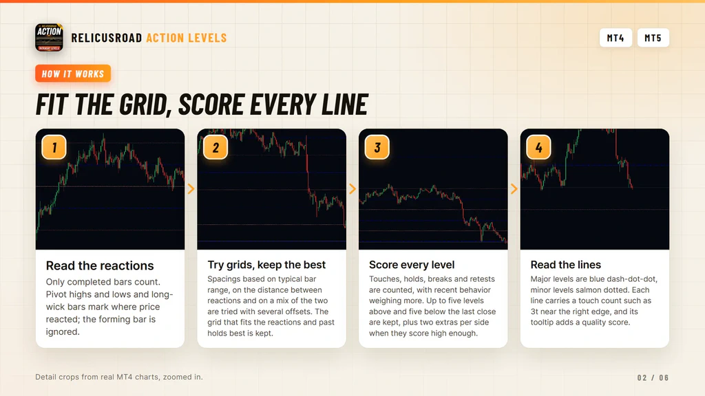
The Grid Can Move, And That Is Honest
This is the part worth understanding before you buy. The grid is not fixed. It is re-fitted as bars complete, checked on each new bar of your own chart, and a new grid replaces the current one only when it fits the data clearly better. If you point it at a higher timeframe than the chart, the re-fit is picked up at your chart’s next bar, not the moment the higher-timeframe bar closes. Small, weak improvements are ignored on purpose, which keeps the lines steady most of the time. Over days and weeks, though, levels do move, appear and disappear.
A tool that never changes its levels is telling you it stopped looking at the market. This one keeps looking, and the trade-off is that yesterday’s line may not be on your chart tomorrow.
The same honesty applies to the prices themselves. Because the offset of the grid is fitted to where
price reacted, the levels do not have to land on round numbers. Sometimes they do, when the market has
been respecting round numbers. Often they sit a little off them, because that is where the wicks
turned.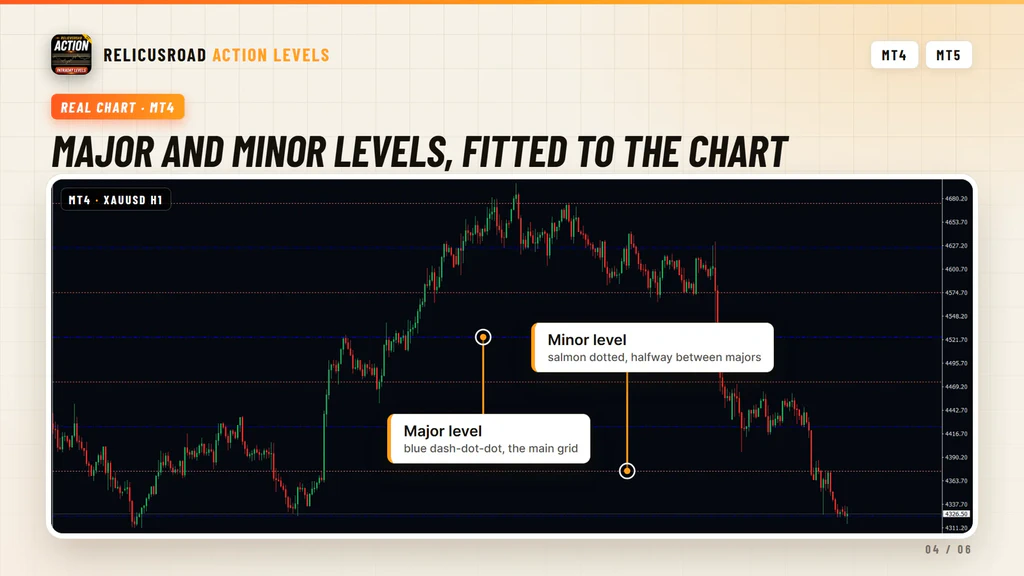
What You See On The Chart
| Element | Meaning |
|---|---|
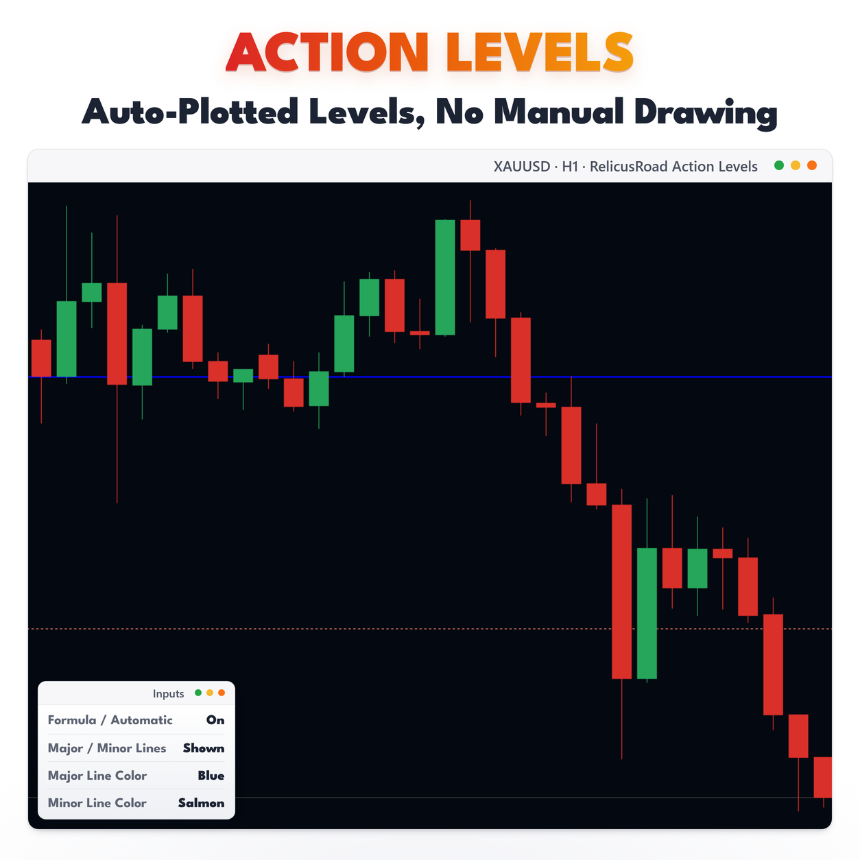
| Blue dash-dot-dot line | A major level from the fitted grid, drawn behind price |
| Salmon dotted line | A minor level, halfway between two majors, shown only when the evidence supports it |
| Small label such as 3t | How many separate times price came to that level inside the window, in the line’s color |
| Tooltip on a line | The level type, the touch count and a quality score from 0 to 1 |
| Nothing else | No zones, no arrows, no support or resistance markers, no Data Window values |
- Blue dash-dot-dot line
- A major level from the fitted grid, drawn behind price
- Salmon dotted line
- A minor level, halfway between two majors, shown only when the evidence supports it
- Small label such as 3t
- How many separate times price came to that level inside the window, in the line’s color
- Tooltip on a line
- The level type, the touch count and a quality score from 0 to 1
- Nothing else
- No zones, no arrows, no support or resistance markers, no Data Window values
Labels sit near the right edge of the chart. When two levels are close enough for their labels to
collide, each extra one steps to the left so both stay readable. Labels are placed when the levels are
drawn, so after you scroll or zoom they settle back into place on the next new bar.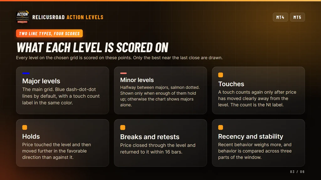
What It Does For Your Trading
Four things, each one you can check on your own chart before you trust it.
Puts Lines Where Price Already Turned
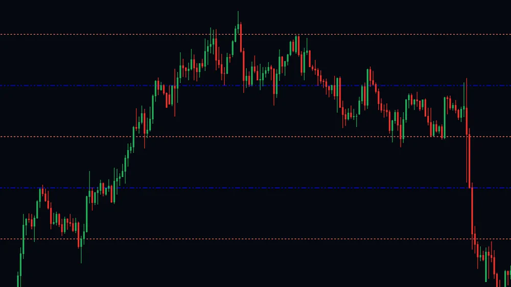
The spacing and the offset of the grid are taken from completed bars, from the swing highs, swing lows and long wicks that show where the market reacted. The bar still forming has no vote.
You stop drawing lines at round numbers and hoping. The prices on the chart are the ones the market has already had an opinion about.
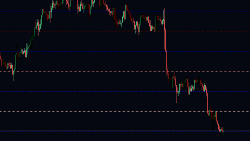
Spacing Fitted To The Instrument
Candidate spacings built from typical bar range and from the gaps between reactions are tested at several offsets, and the grid that lands closest to those reactions is the one kept.
That is the tuning you would otherwise do by hand on every symbol. Gold and EURUSD get their own spacing without you touching a setting.
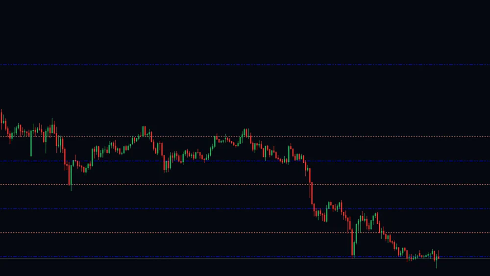
Only The Levels Near Today
Up to five levels above the last close and five below are kept, plus up to two extras a side when they score well. Fourteen at most, and no ladder stretching off the top of the screen.
The chart stays readable, and every line you can see is one price could reach in the session you are trading, not a decoration from three months ago.
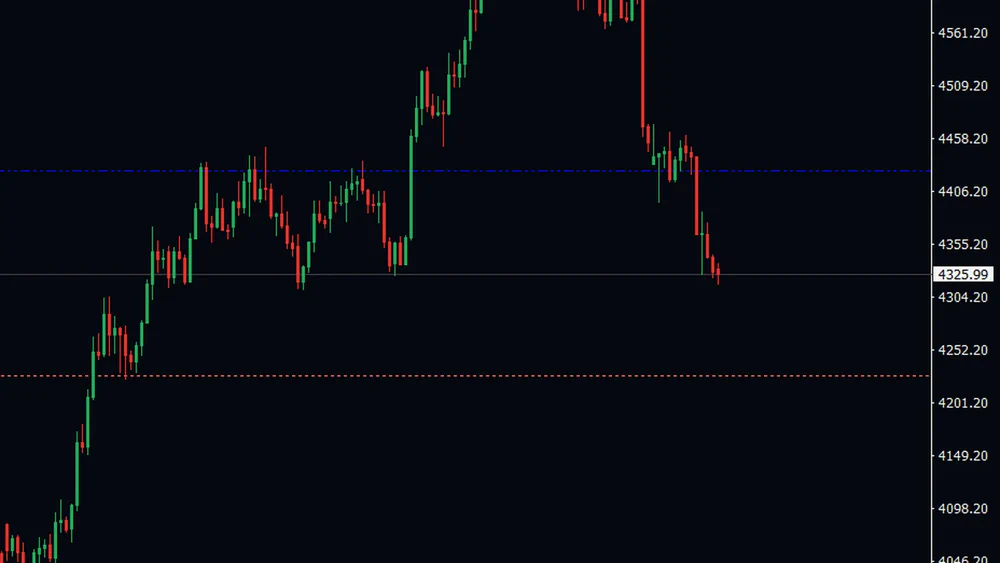
Re-Checked, Never Frozen
As bars on your chart complete, the fit is checked again. A different grid takes over only when it fits the data clearly better, so small improvements are ignored and the lines hold still most of the time.
This is the honest half of the deal. Levels can move, appear or disappear over days, and that is what keeps them measured against the market as it is now rather than as it was when you first opened the chart.
Reading It On A Live Chart
Start with the touch counts. A line labeled 1t is a level the market has visited once inside the window. A line labeled 5t or 6t has been tested again and again, and it is the one worth watching as price approaches. Hover it and the tooltip adds the quality score, which tells you how cleanly those visits behaved.
Then look at the spacing. Price sitting between two majors with a minor in the middle gives you three reference prices for the session. Price pinned against the top major with nothing above it on the chart means the next drawn level is out of the visible range, which is its own piece of information.
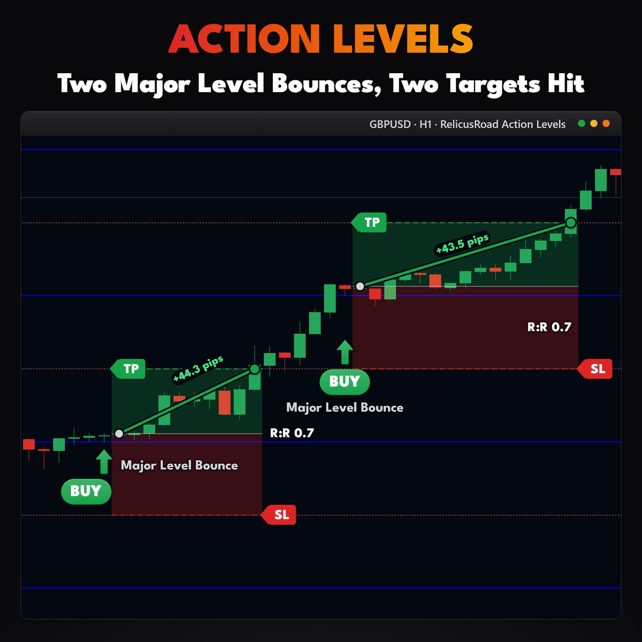
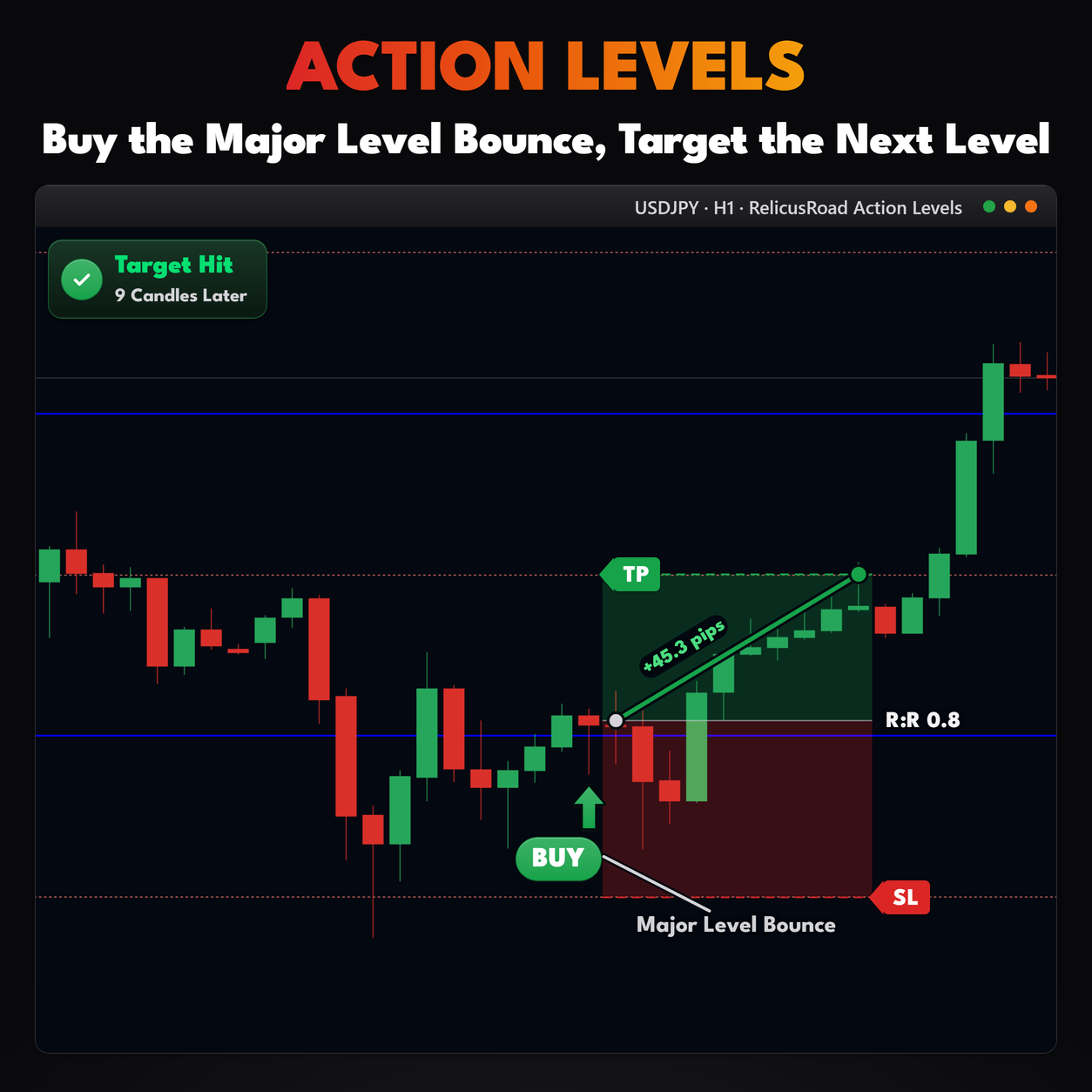
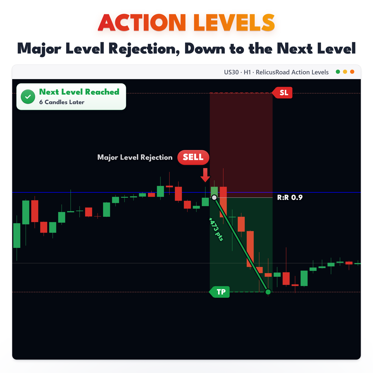
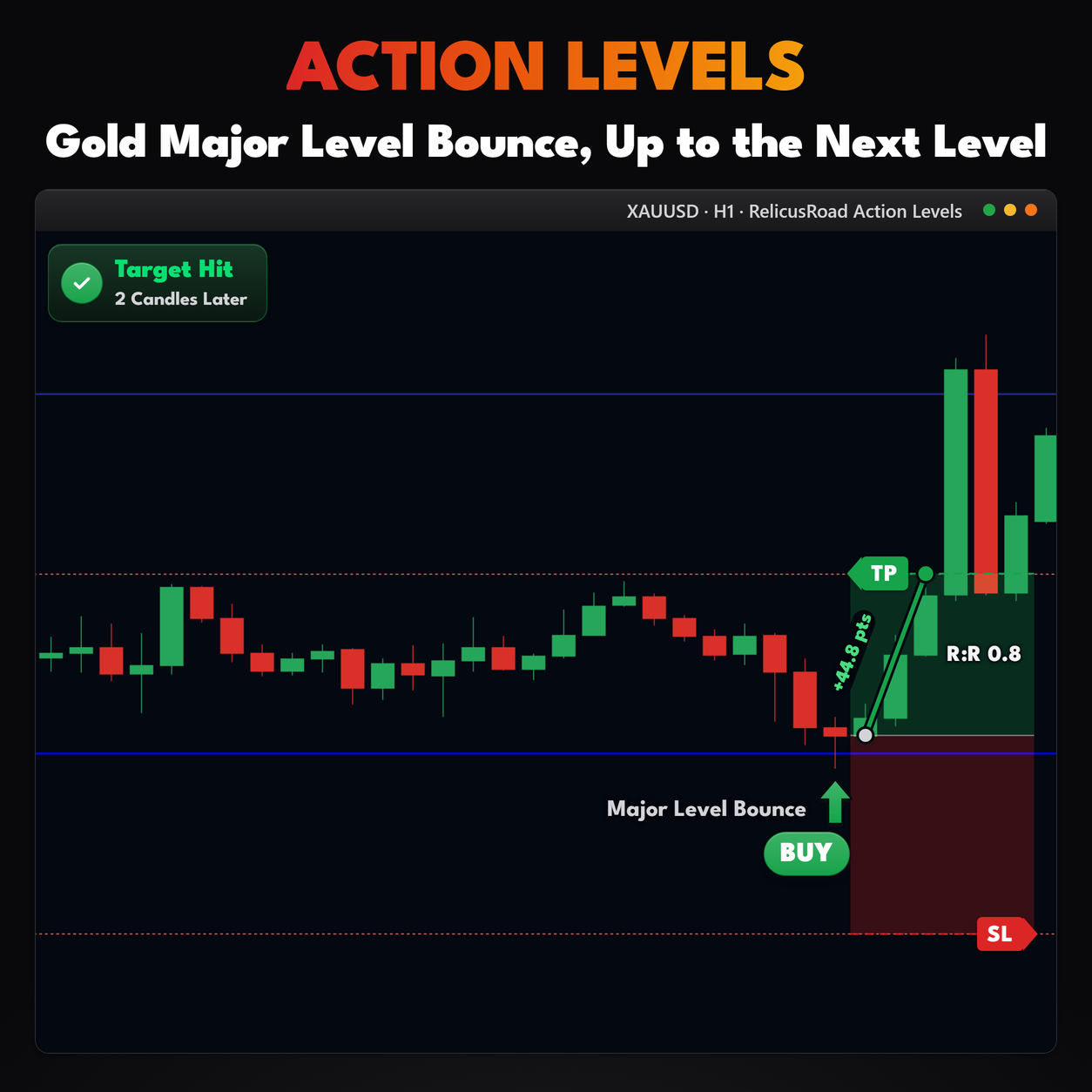
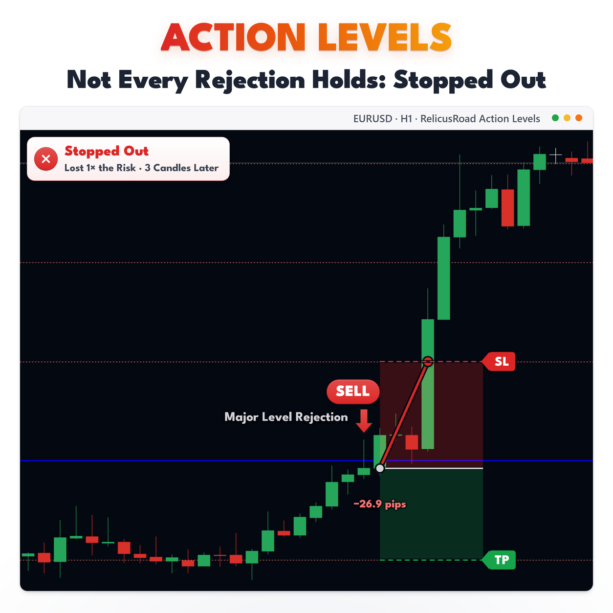
The grid tells you where, not when. It has no opinion about direction, and a level being touched is not
a signal to trade it.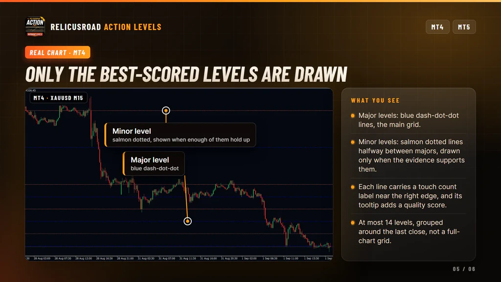
Settings You Can Change
Formula mode, the default. Formula / Automatic stays on. Timeframe picks which bars feed the calculation, with Current meaning the chart you attached it to. Show Major Level and Show Minor Level toggle each set of lines. Major Line Style and Minor Line Style are dash-dot-dot and dotted. Major Line Color and Minor Line Color are blue and salmon, and each color is used for that line’s label too.
Legacy mode. Turning Formula / Automatic off gives you the older grid, which has its own four inputs: Multiplier, Max Lines, Use Adaptive Levels and Use Dynamic Rounding. That grid is built from a per-symbol table, and its spacing depends on how far you are zoomed in.
Be clear about those four inputs. They do nothing while Formula mode is on. They are not global tuning knobs, and changing them will not move a single Formula line.
What It Does Not Do
Worth knowing before you buy:
- It does not send alerts. The Show Alerts input exists, but no popup, push, email or sound is delivered in this build.
- It does not fill buffers, so no Expert Advisor and no Data Window can read the levels.
- It does not force levels onto round numbers, because the grid offset is fitted to reactions.
- It does not draw a full-chart grid. You get at most fourteen levels around the last close.
- It does not label a level as support or resistance. It counts touches and leaves the reading to you.
- It does not build levels from the trading day. For session-anchored prices use RelicusRoad Daily Pivots.
- It needs at least 97 bars on the selected timeframe before it can fit anything.
Setup In Three Steps
- Buy it on the MQL5 Market and install it from the Market tab of your terminal.
- Drag RelicusRoad Action Levels from Navigator, Indicators, Market onto a chart with enough history loaded. The defaults are ready to use.
- Leave Formula / Automatic on, and set Timeframe if you want the grid built from a higher timeframe than the one you are watching.
It runs on forex, gold, indices, stocks and crypto. Formula mode never looks at the symbol name, so an
unusual instrument gets the same treatment as EURUSD. Give the chart a moment to load history before
you judge the grid.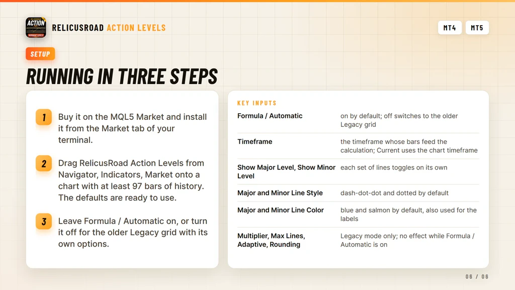
Where It Comes From
The scored level grid is the Action Levels engine inside RelicusRoad Pro, published on its own for traders who want a fitted grid of prices and not the whole system. It runs standalone and needs no other RelicusRoad product.
Support runs through the product comments and the mql5.com messaging system.
Frequently Asked Questions
Everything you need to know about RelicusRoad Action Levels. Still curious? Reach out anytime.
Learn How to Trade It
Every indicator ships with reference documentation and a matching strategy guide. You can also read what other traders say or start with the setup guide.
Indicator Reference
- Road Levels Dynamic S/R levels around a moving center line
- Support & Resistance Advanced S/R zones with alerts
- Action Levels Critical price levels for major moves
- Signal Lines Trend bias filter with two independent lines
- Daily High/Low/Open Daily extremes for range trading
- Daily Pivots Pro pivot points S1-S3, R1-R3
Trading Strategies
- Strategy #1: Price Action (Road) + SR + Trendlines + 2 TFs
- Strategy #2: Local Trendline + Price Position on Road + 2 TFs
- Strategy #3: Arrows + Price Action (Road) + SR
- Strategy #4: MicroScalping + Multiple Pairs + Daily Target 2-10%
Trading Guides
- Non-Repaint Forex Indicators: What 'Non-Repaint' Actually Means (and How to Verify It)
- Prop Firm Challenges: The 'Slow Boring' Strategy to Getting Funded
- Market Sessions Trading: How to Time the 'London-NY Overlap'
- What Is Forex Trading and How Does It Work?
- The Real Cost of Trading Platforms in 2026: A Broker-Neutral Teardown
- Position Sizing: The Boring Math That Keeps Traders Alive
- Forex Trading Psychology: 7 Traps and Process Fixes
Related tools
Single RelicusRoad indicators for MT4 and MT5, each one standalone.