What It Does
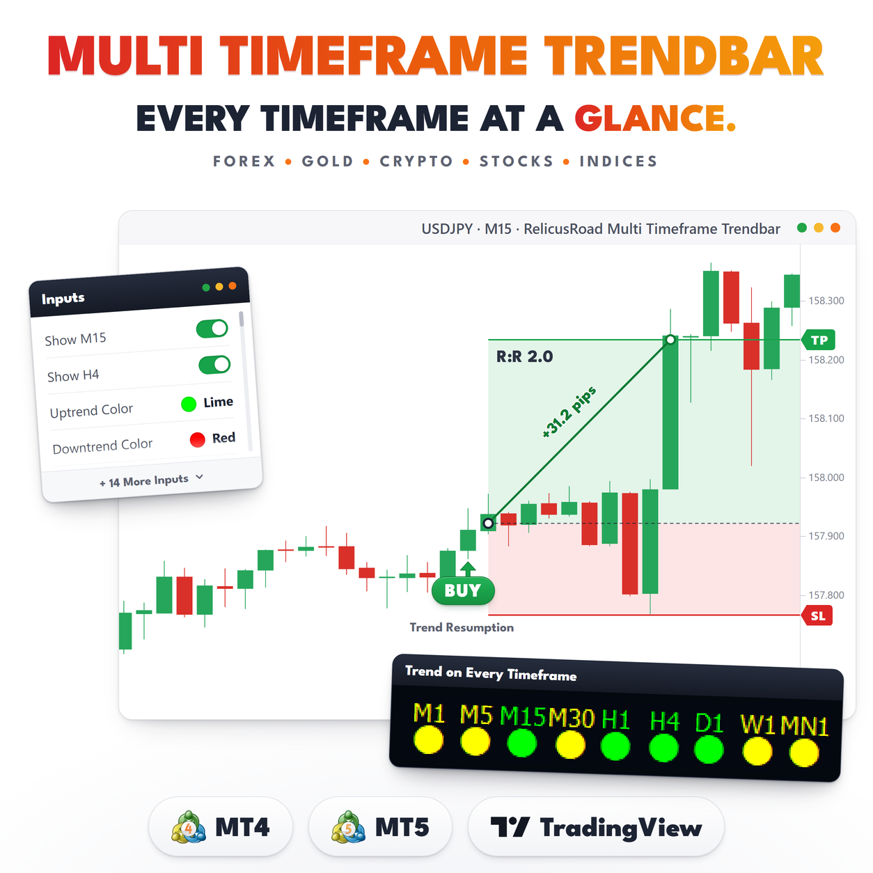
Multi Timeframe Trendbar puts nine timeframes in the corner of one chart. M1, M5, M15, M30, H1, H4, D1, W1 and MN1, each with a name and a colored dot underneath it. Lime is up, red is down, yellow is no direction.
The point is to stop switching charts. When you are working an M15 entry, you still want to know whether H4 and D1 agree with you, and this answers that in the corner of your eye instead of in three more windows.
Nothing is drawn on the candles. The row sits in the lower right, the labels cannot be selected by
accident, and the indicator adds no lines, arrows or panels to the price area.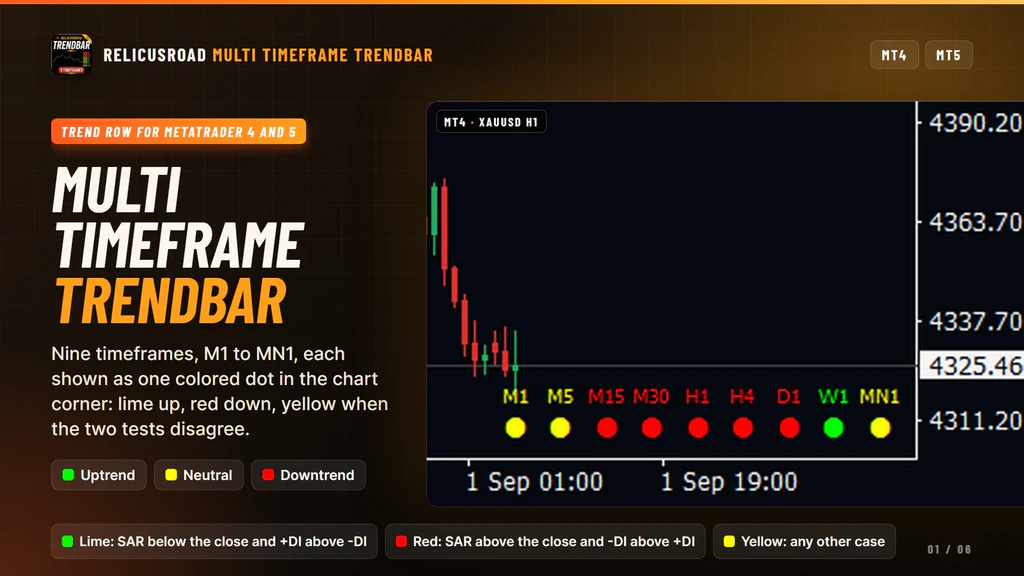
How It Works
Each timeframe gets the same two-part test, run on that timeframe’s own data.
- Parabolic SAR, step 0.02 and maximum 0.2, compared with the close.
- The directional lines of ADX, period 14, comparing plus DI with minus DI.
Both have to agree. SAR below the close and plus DI above minus DI gives an uptrend, and the dot turns lime. SAR above the close and minus DI above plus DI gives a downtrend, and the dot turns red. Anything else, including the case where the two tests point different ways, is neutral and the dot turns yellow.
Yellow is doing real work here. It is not a filler state, it is the indicator refusing to call a
direction it cannot support with both tests.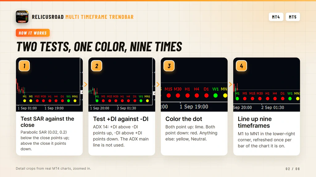
It Refreshes Once Per Chart Bar
This is the behaviour to understand before you rely on the row. All nine readings are recalculated when a new bar opens on the chart you attached the indicator to, not tick by tick.
On an M1 chart that is once a minute and the row is close to live. On an H4 chart the whole row, including the M1 dot, is recalculated once every four hours, so a short-timeframe dot can be hours behind the market. Attach it to a short timeframe you watch anyway and that problem goes away.
The second half of the same point is that each reading comes from the bar still forming on its own
timeframe. That is deliberate, because a D1 state that only updated at midnight would be useless by
lunchtime, but it does mean a dot is a snapshot and the same dot can read differently at the next
refresh.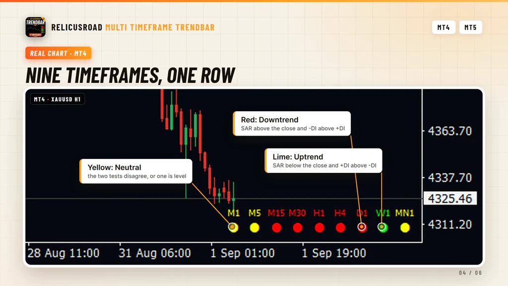
What You See On The Chart
| Element | Meaning |
|---|---|
| Lime dot | SAR is below the close and plus DI is above minus DI on that timeframe |
| Red dot | SAR is above the close and minus DI is above plus DI |
| Yellow dot | The two tests disagree, so no direction is shown |
| Timeframe name | M1 through MN1, above its dot, in the same color as the dot |
| Row position | Lower right corner, M1 on the left and MN1 nearest the edge |
- Lime dot
- SAR is below the close and plus DI is above minus DI on that timeframe
- Red dot
- SAR is above the close and minus DI is above plus DI
- Yellow dot
- The two tests disagree, so no direction is shown
- Timeframe name
- M1 through MN1, above its dot, in the same color as the dot
- Row position
- Lower right corner, M1 on the left and MN1 nearest the edge
Every dot is the same filled circle. Direction lives in the color, not in the shape, so there are no
arrows to misread at a glance.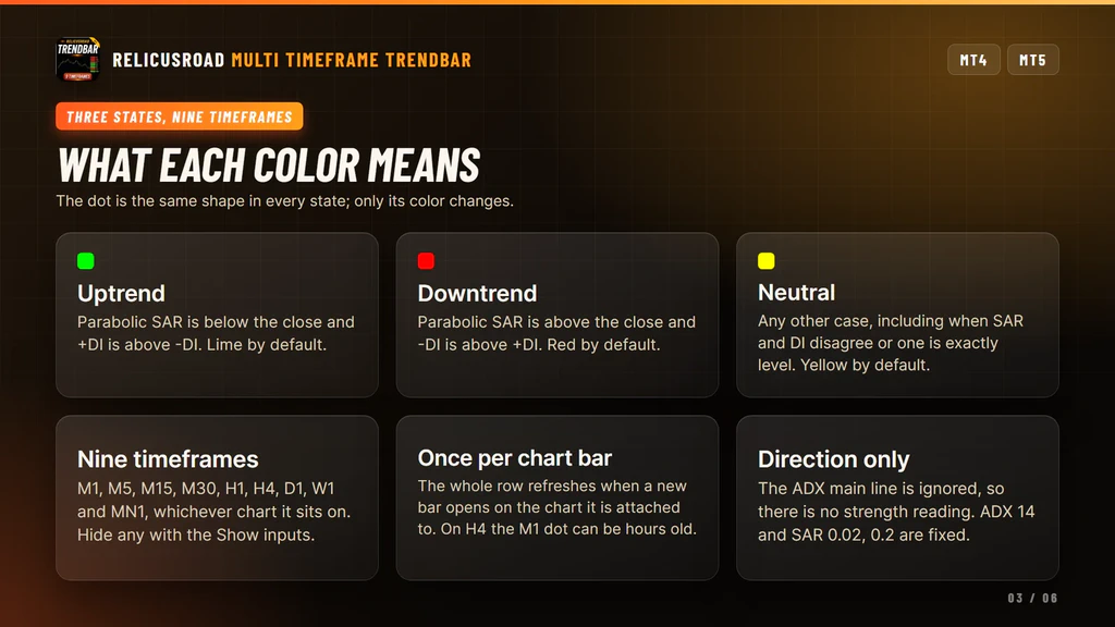
What It Does For Your Trading
Four things, each one you can check on the chart before you trust it.
Nine Timeframes Without Leaving The Chart
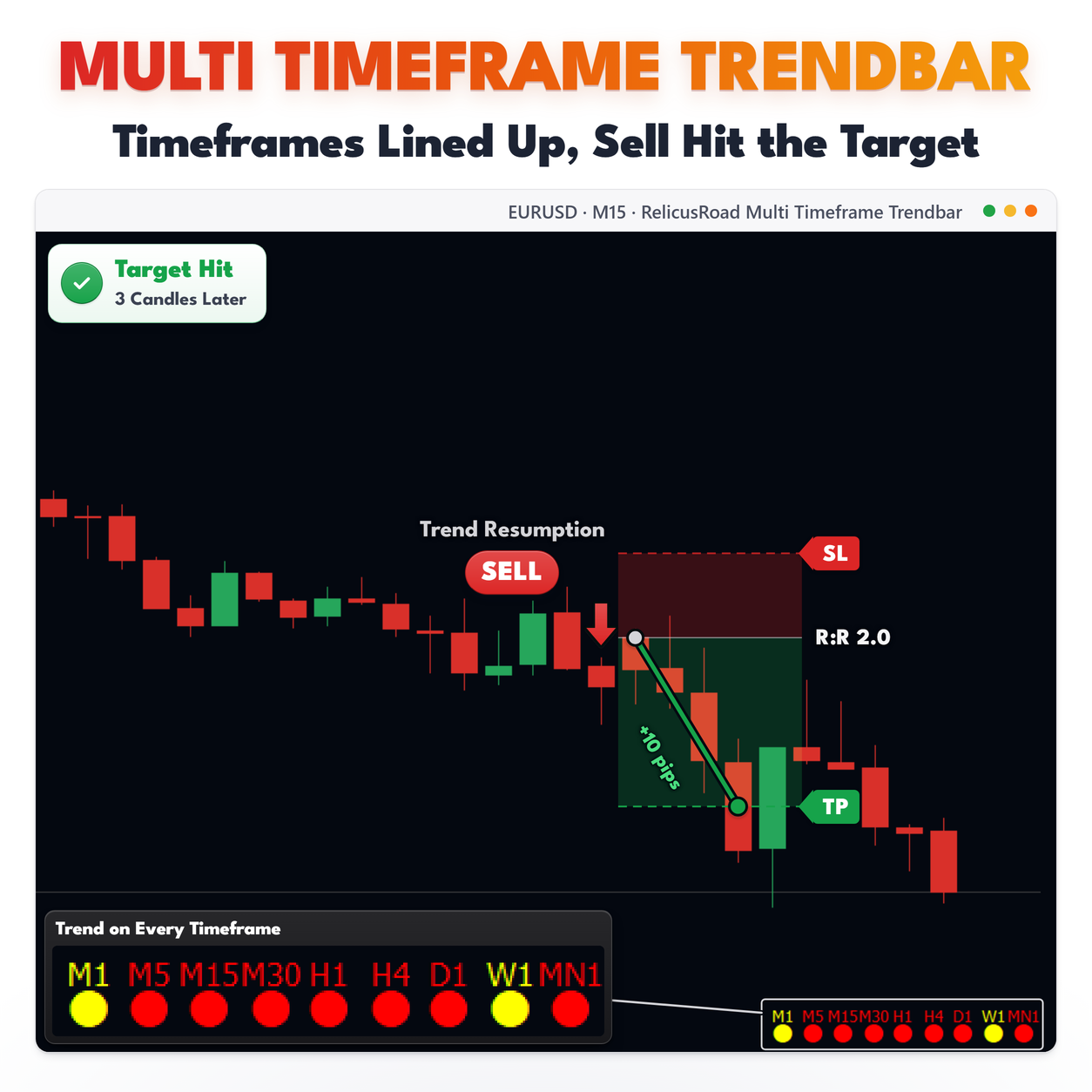
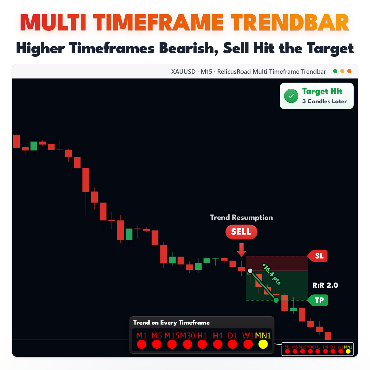
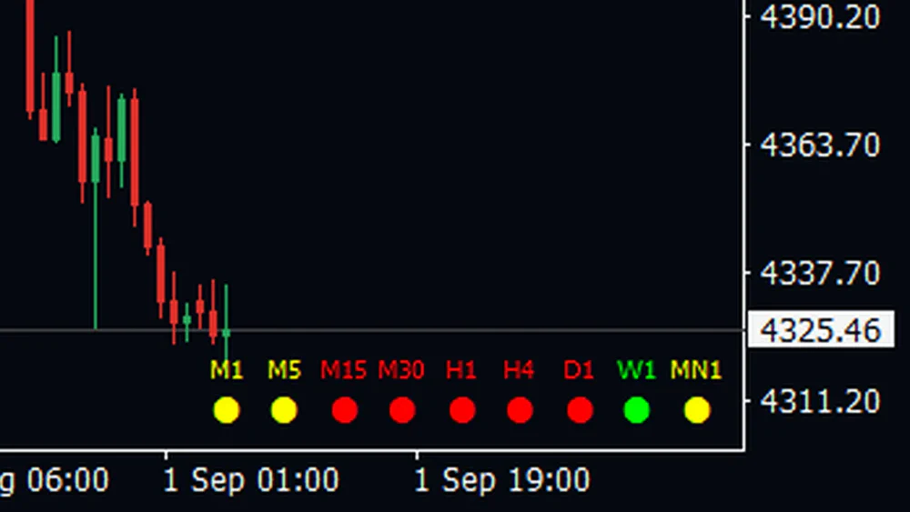
The row sits in the lower right of the chart you are already on. In this crop M15 through D1 are red, the two shortest timeframes have gone yellow, and W1 is still green, so the whole picture is one glance wide.
That is three or four charts you no longer have to open before taking a position, and the check happens in the same second you look at price.
Shows Where The Turn Starts
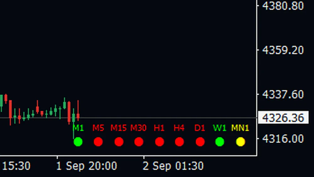
Turns arrive on the short timeframes first. Here M1 has gone green while everything from M5 to D1 is still red, which is what the very start of a bounce looks like in the row.
That tells you what kind of trade is on offer. A green M1 inside a red block is a counter-trend push to manage tightly, not the trend change your entry rules are waiting for.
Built To Read At A Glance
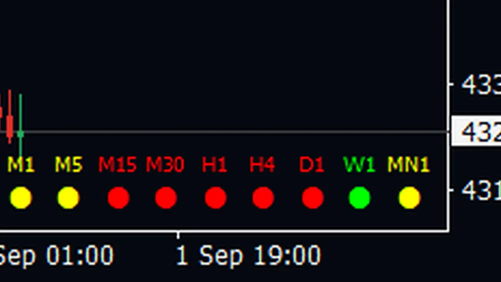
Each name sits directly above its dot and shares its color, so you read the row by shape rather than by studying it. Both the text size and the dot size are inputs, and raising them spreads the columns further apart.
On a busy screen, a readout you have to lean in for is a readout you stop checking. This one stays legible from wherever you sit.
Refreshes When A Bar Closes
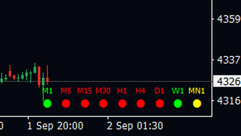
All nine readings are recalculated when a new bar opens on the chart the indicator is attached to. On this M15 chart that is every fifteen minutes, and each dot reads the bar currently forming on its own timeframe.
Knowing the refresh rate is what makes the row usable. Attach it to a chart you watch anyway and the dots stay current; attach it to a daily chart and the M1 dot will be a day old, which is exactly the kind of detail a dashboard should not hide from you.
Reading It On A Live Chart
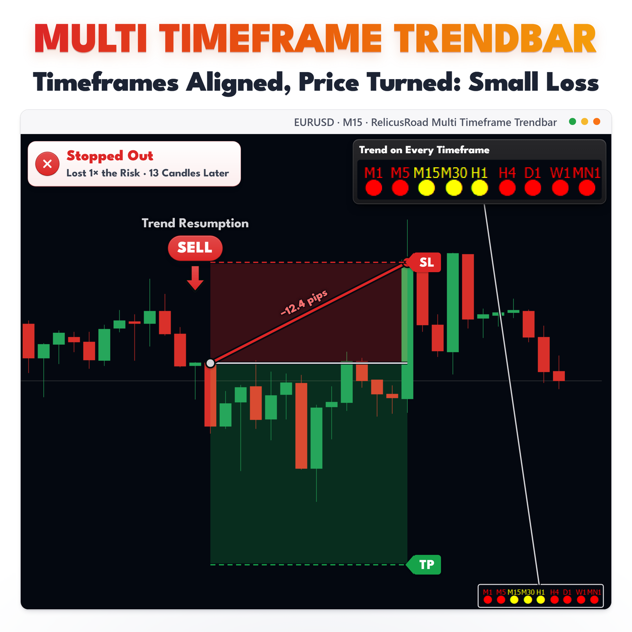
A row that is one color from M1 to MN1 is the easy case. Everything agrees, and your job is to trade with it rather than look for the turn.
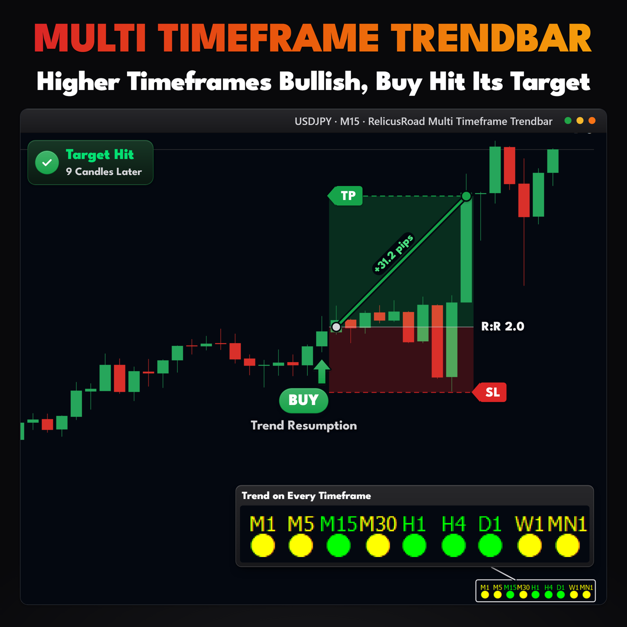
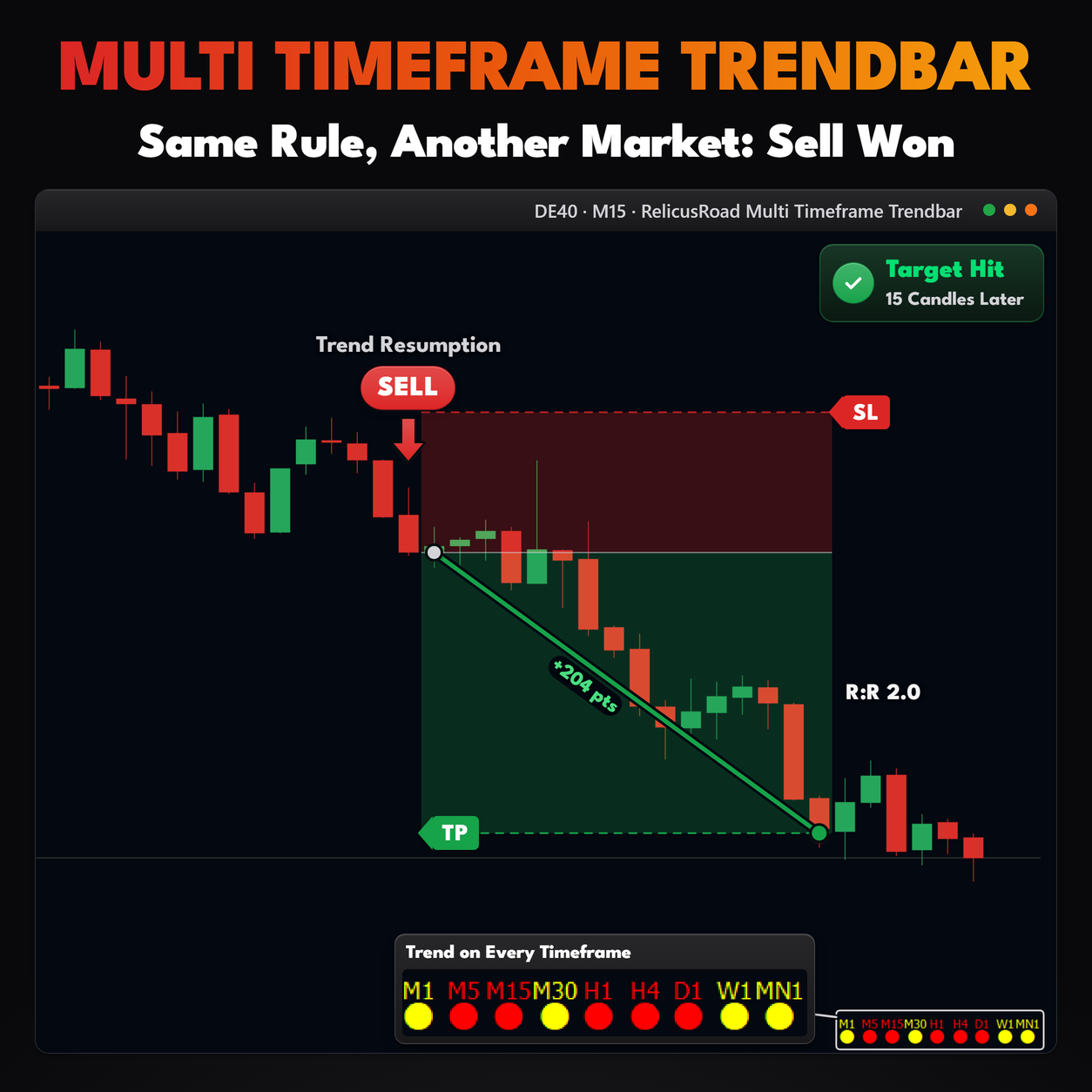
The useful reading is the boundary. Lime on M1 to H1 with red on D1, W1 and MN1 puts a line through the row, and that line tells you what kind of trade you are in: a counter-trend push on the lower timeframes inside a bigger downtrend. Trades taken against the higher dots usually need tighter management, and the row shows you which ones those are before you click.
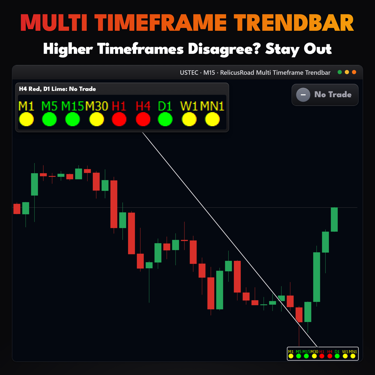
Yellow clusters are worth respecting too. A run of yellow in the middle of the row means SAR and the
DI lines have stopped agreeing on the timeframes you trade, which is often what a range looks like
here.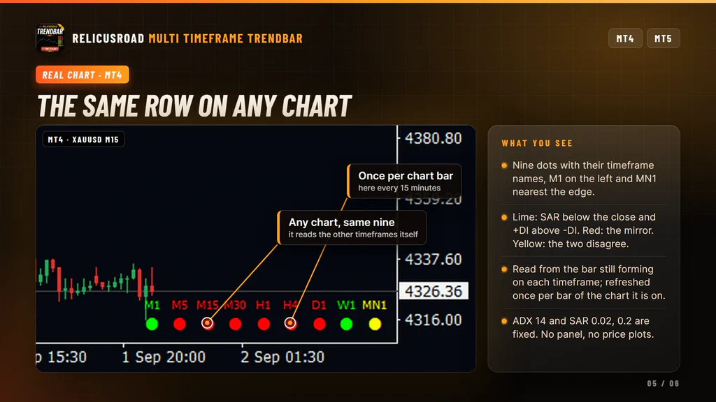
Settings You Can Change
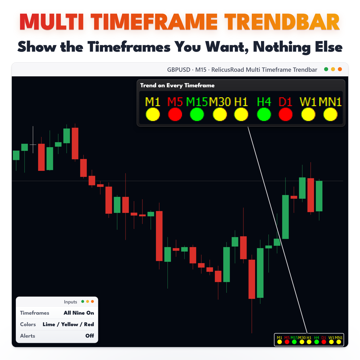
Which timeframes appear: nine on and off switches, one per timeframe, all on by default. Hide the ones you never trade and the row gets shorter and easier to read.
Colors: the up color, lime by default, the neutral color, yellow, and the down color, red. The dot and its name always share the state color.
Sizes: text size, 6 by default, which also widens the spacing between columns, and dot size, 10 by default. On a crowded or high resolution screen, raising both is the quickest way to make the row legible.
The test itself has no settings. ADX 14 and SAR 0.02 with a 0.2 maximum are fixed, which keeps the reading consistent across every chart you attach it to.
What It Does Not Do
Worth knowing before you install:
- It does not measure trend strength. The ADX main line is not part of the test.
- It does not combine the timeframes into one score. Each dot stands alone.
- It does not update between chart bars, so the row goes stale on higher chart timeframes.
- It does not draw arrows, bars or a panel, and it plots nothing on the candles.
- It does not send alerts in this build, and it does not place or manage trades.
Setup In Three Steps
- Buy it on the MQL5 Market and install it from the Market tab of your terminal.
- Drag RelicusRoad Multi Timeframe Trendbar from Navigator, Indicators, Market onto a low timeframe chart, so the row refreshes often.
- Open each timeframe once, so the terminal has downloaded the history all nine readings need.
It runs on forex, gold, indices, stocks and crypto. One copy on one chart covers the whole range, and
the nine source timeframes stay the same whichever chart you attach it to.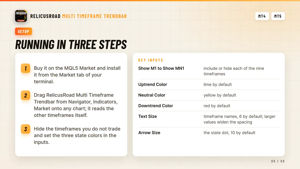
Where It Comes From
The corner row is the multi-timeframe readout from RelicusRoad Pro, published on its own for traders who want a quick trend check and none of the rest. It runs standalone and needs no other RelicusRoad product. For the same question answered on the chart itself, SuperTrend gives you a trailing line per chart, and Signal Line colors a moving average by the filter you choose.
Support runs through the product comments and the mql5.com messaging system.
Frequently Asked Questions
Everything you need to know about RelicusRoad Multi Timeframe Trendbar. Still curious? Reach out anytime.
Learn How to Trade It
Every indicator ships with reference documentation and a matching strategy guide. You can also read what other traders say or start with the setup guide.
Indicator Reference
- Road Levels Dynamic S/R levels around a moving center line
- Support & Resistance Advanced S/R zones with alerts
- Action Levels Critical price levels for major moves
- Signal Lines Trend bias filter with two independent lines
- Daily High/Low/Open Daily extremes for range trading
- Daily Pivots Pro pivot points S1-S3, R1-R3
Trading Strategies
- Strategy #1: Price Action (Road) + SR + Trendlines + 2 TFs
- Strategy #2: Local Trendline + Price Position on Road + 2 TFs
- Strategy #3: Arrows + Price Action (Road) + SR
- Strategy #4: MicroScalping + Multiple Pairs + Daily Target 2-10%
Trading Guides
- Non-Repaint Forex Indicators: What 'Non-Repaint' Actually Means (and How to Verify It)
- Prop Firm Challenges: The 'Slow Boring' Strategy to Getting Funded
- Market Sessions Trading: How to Time the 'London-NY Overlap'
- What Is Forex Trading and How Does It Work?
- The Real Cost of Trading Platforms in 2026: A Broker-Neutral Teardown
- Position Sizing: The Boring Math That Keeps Traders Alive
- Forex Trading Psychology: 7 Traps and Process Fixes
Related tools
Single RelicusRoad indicators for MT4 and MT5, each one standalone.