What It Does
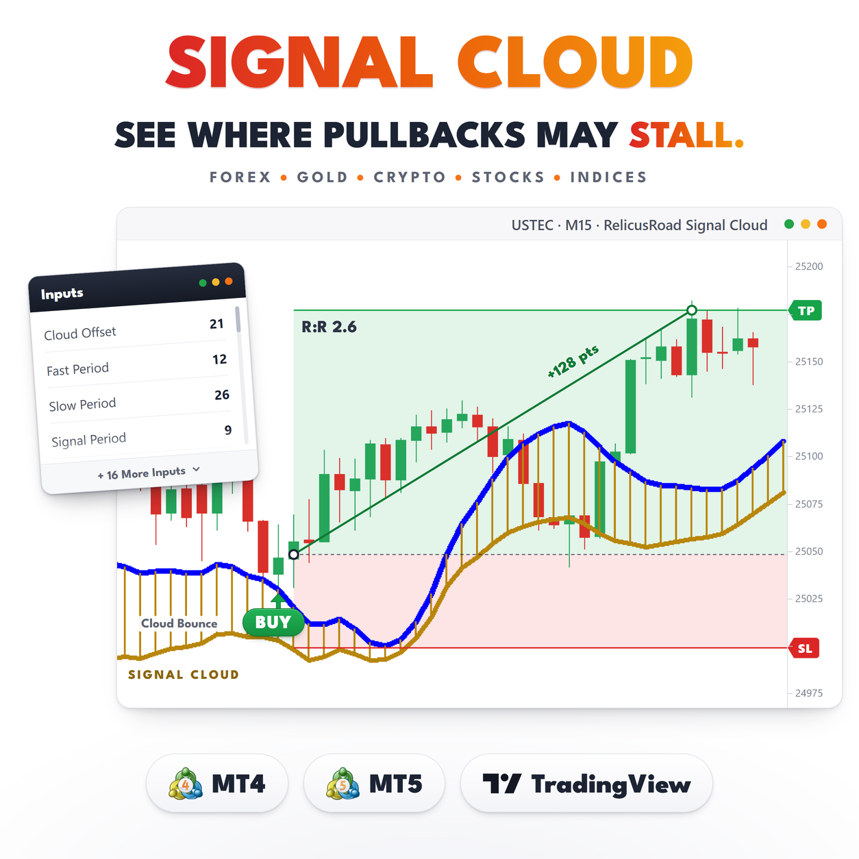
Signal Cloud draws one band in the price window and pushes it 21 bars to the right. The band is wide when the market is trending hard and narrow when it is not, and because it runs ahead of the newest candle you can see the zone price is walking into before it gets there.
The width comes from the distance between the 12 and 26 period exponential moving averages, the same distance the MACD line measures below your chart. When those two averages pull apart, the band opens. When they converge, it closes.
There is nothing else on the chart. Two dotted edges, a fill between them, no arrows, no labels, no
panel.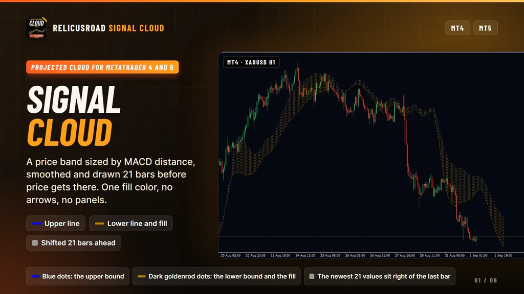
How It Works
Four steps, in this order.
- Measure the gap. Take the absolute distance between the EMA 12 and the EMA 26 of close.
- Build the band. Add that gap to a 3-period EMA of close for the upper bound and subtract it for the lower bound.
- Smooth both edges. A 9-period simple average runs over each bound so the edges move gradually instead of jumping bar to bar.
- Shift it forward. All three plots are moved 21 bars to the right.
The center is a fast average, so the band tracks price closely. The width is a trend measure, so the
shape of the band tells you about agreement between fast and slow, not about price alone.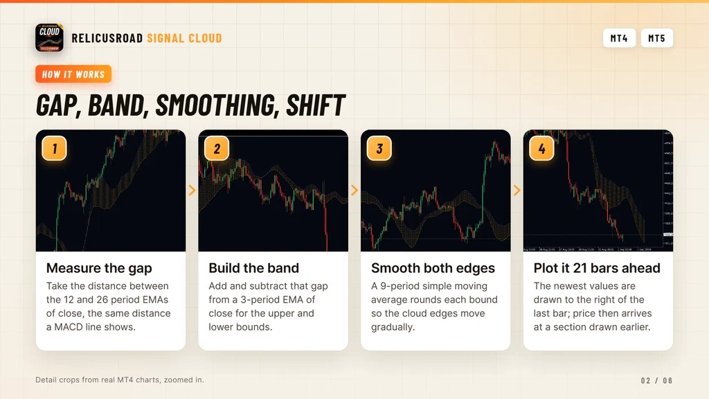
The Forward Shift Is Not A Forecast
This is the part to understand before you trade with it. Every value in the cloud is built from bars that have already closed. The shift moves the drawing, not the data.
So the section sitting over your current candles was computed 21 bars ago, and the section to the right of price was computed from the newest closed bars. Nothing in it predicts the next candle. What it gives you is a zone that was defined before price arrived, which is a cleaner reference than a level you draw after the move.
Two timing notes. The cloud recalculates when a new bar opens, not on every tick. And the lower edge
reads the current bar as it opens, so after a chart reload the recent history is rebuilt from final
closes and that edge can settle slightly differently from what you watched live.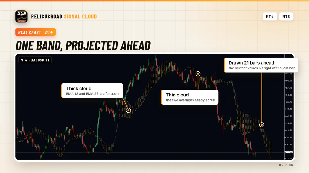
What You See On The Chart
| Element | Meaning |
|---|---|
| Blue dotted line | The upper bound of the band |
| Dark goldenrod dotted line | The lower bound |
| Filled area | The cloud itself, one color at all times |
| Section right of price | The newest 21 values, with no candles under them yet |
| Band width | How far apart the 12 and 26 period EMAs are |
- Blue dotted line
- The upper bound of the band
- Dark goldenrod dotted line
- The lower bound
- Filled area
- The cloud itself, one color at all times
- Section right of price
- The newest 21 values, with no candles under them yet
- Band width
- How far apart the 12 and 26 period EMAs are
The fill never changes color with direction. That is deliberate. As a context layer it leaves the
verdict to you, so the reading comes from where price sits against the band and from the slope of the
edges, not from a color telling you what to think.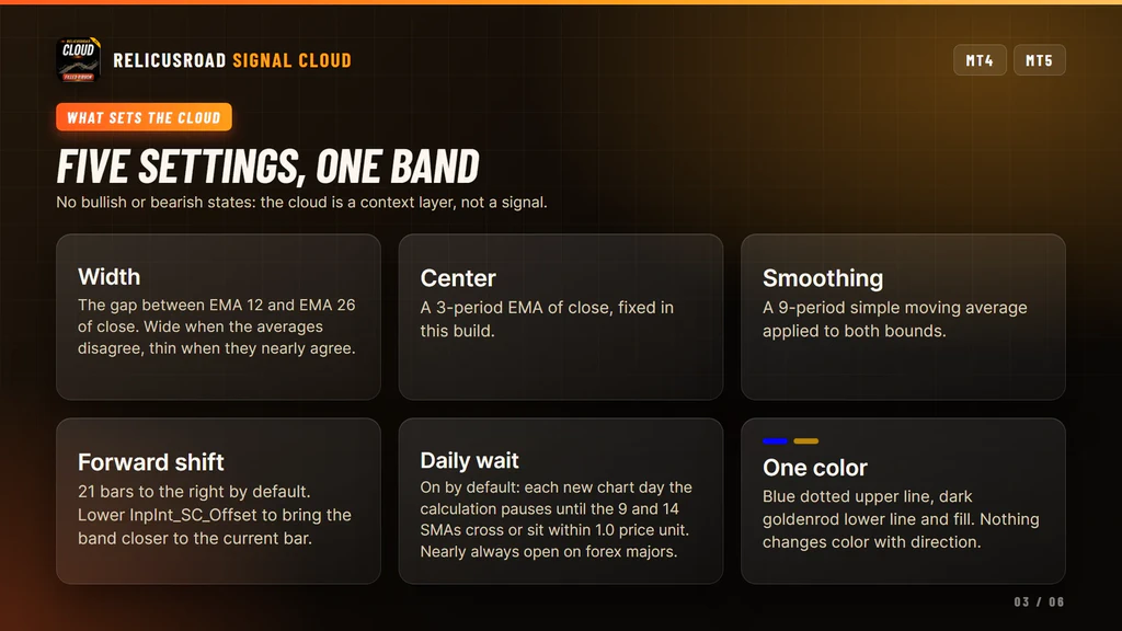
What It Does For Your Trading
Four things, each one you can check on the chart before you trust it.
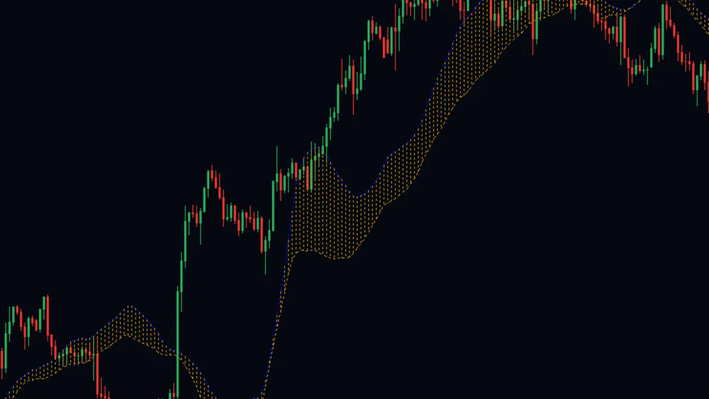
Shows How Hard The Market Is Pushing
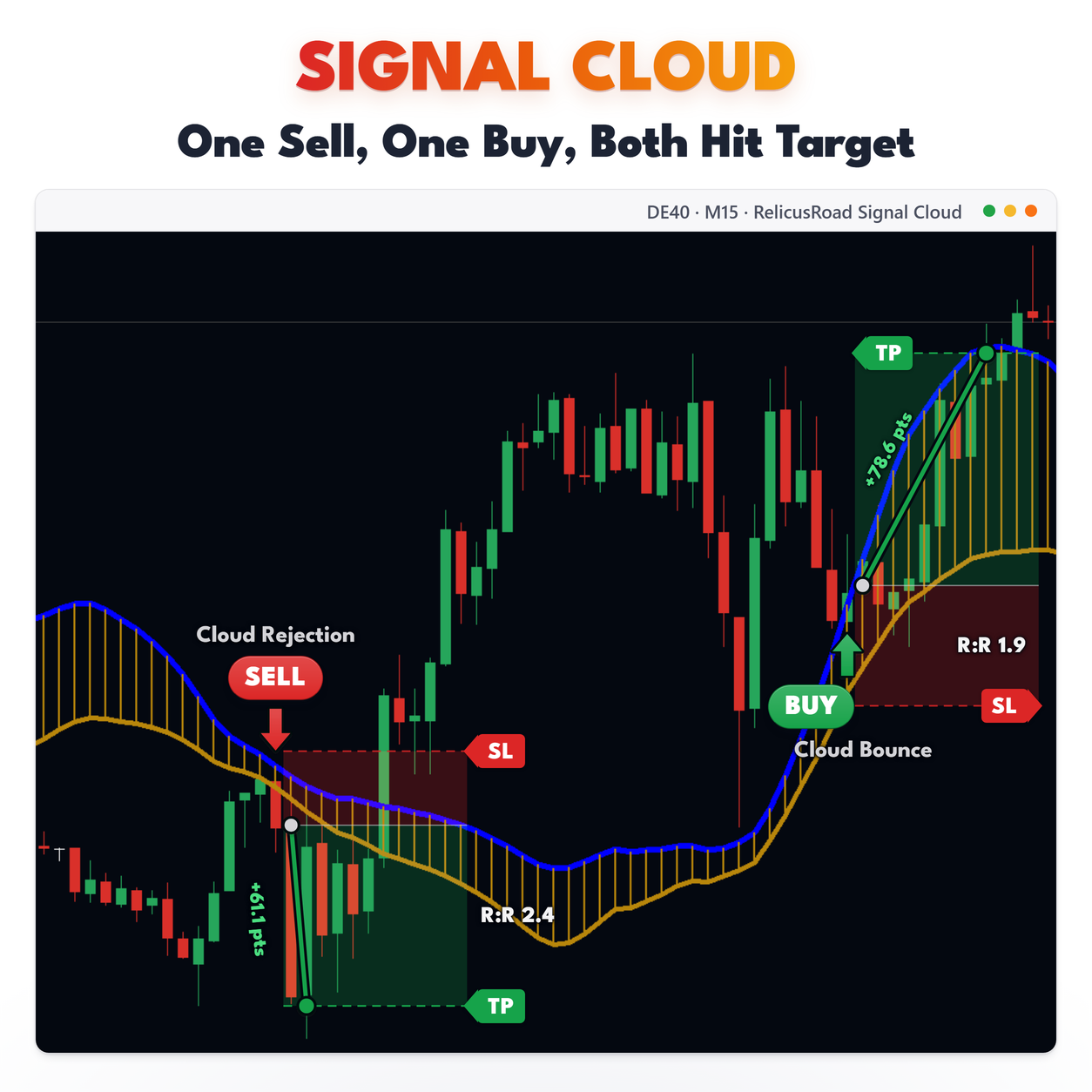
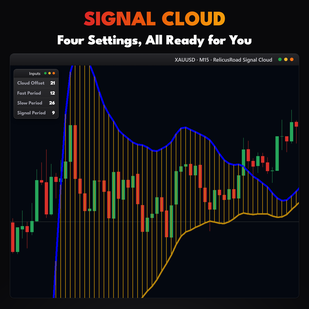
The band is as wide as the gap between the 12 and 26 period averages. Flat market, thin band. Strong run, the band opens out, as it does through the middle of this crop.
Width gives you a size check before you commit. A breakout while the band is still pinched is a different trade from one that starts with the band already stretched, and you can see which one you have without measuring anything.
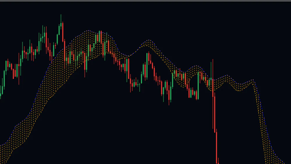
Gives Every Pullback A Boundary
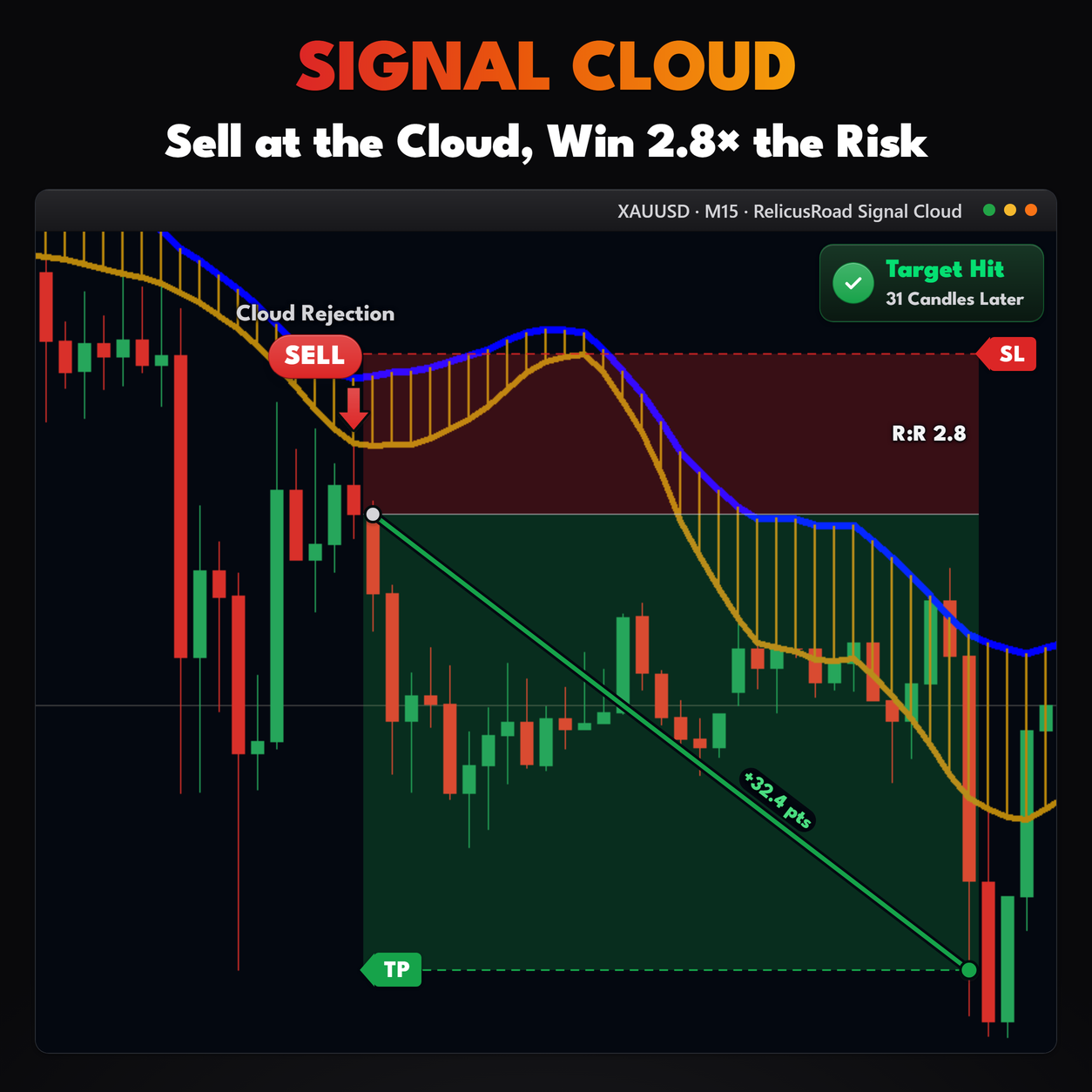
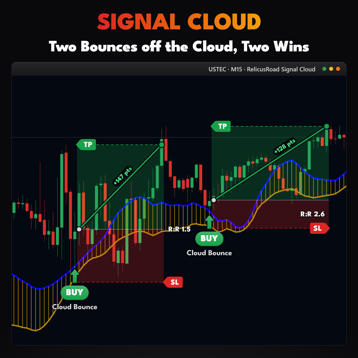
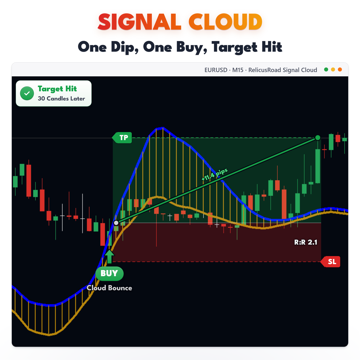
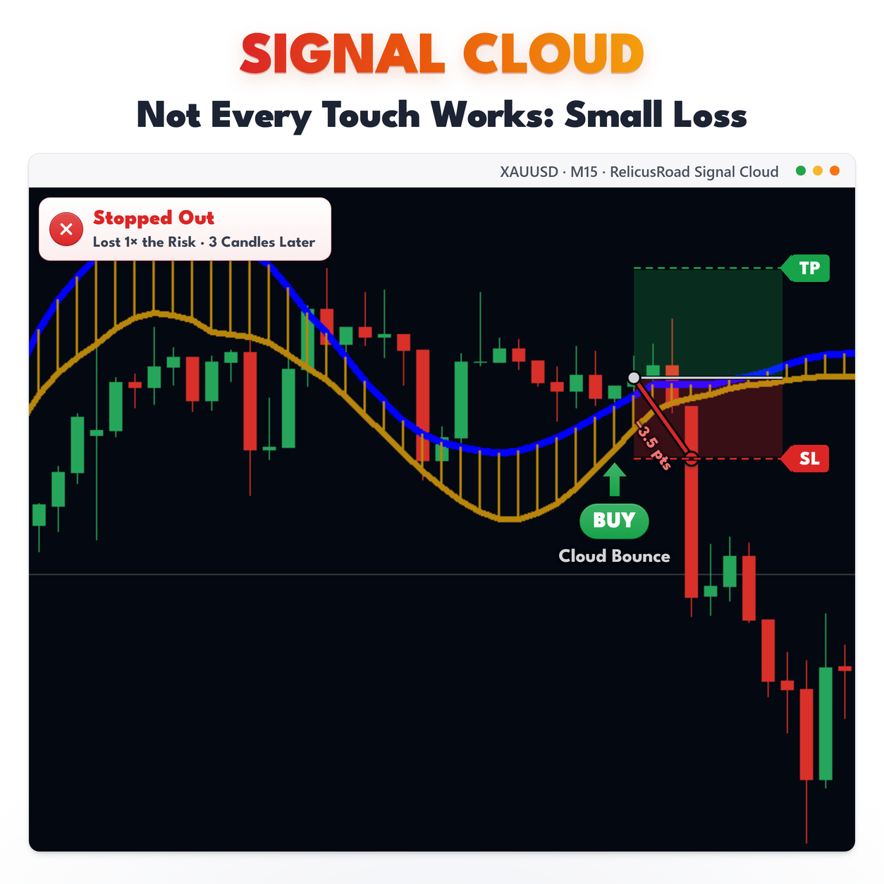
The band is built around a fast average of close, so price spends most of a trend on one side of it and dips back to its edge on pullbacks. Here the candles ride the top edge, then cut through as the whole band rolls over.
That gives you a line to be wrong against. Pullbacks that hold the edge keep the move intact, and the close that cuts through is the one worth reacting to.
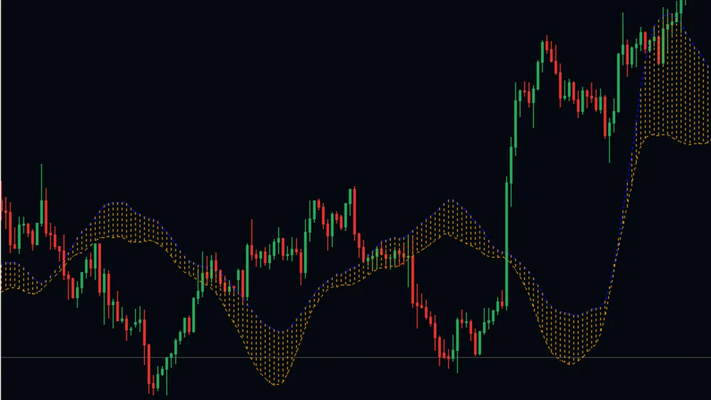
Stays Smooth When Price Does Not
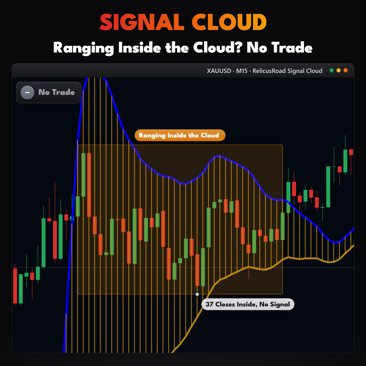
Both edges are smoothed with a 9-period average, so the cloud rolls rather than jumps. Through the chop in this crop the band keeps one shape while the candles scatter above and below it.
That is what makes it usable as context. A boundary that jerks around with every bar is one more thing to second-guess; this one stays where it was while you decide.
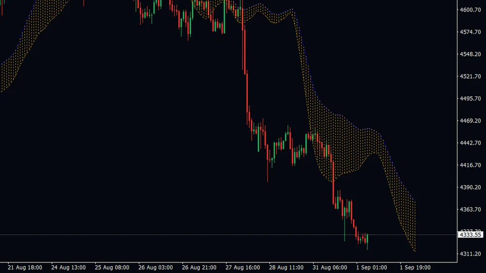
Draws The Zone Before Price Arrives
Every value is plotted 21 bars to the right, so the band always runs past the newest candle, as it does here. Price then walks into a section that was drawn from bars that had already closed.
This is not a forecast, and that is the point. The zone you are trading into was set before the move started, so you are not drawing a level after the fact and then congratulating yourself when price respects it.
Reading It On A Live Chart
Start with the width. A band that keeps opening says the fast and slow averages are pulling apart, which is what a trend looks like in this measure. A band that squeezes flat says they have converged and the market has no clear push.
Then the position. Price riding along the upper edge while the band climbs is a different market from price cutting through the middle of a flat band, even if the candles look similar. Because the band leads price, the edge you are watching was set by bars that closed some time ago, so a touch is a touch of a zone that was already there.
Keep the slope in view too. The projected section shows where the edges are heading over the coming
bars, which makes it easy to see whether a pullback is walking into a widening band or a closing one.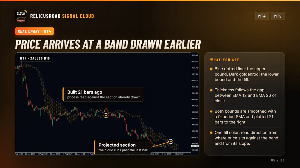
Settings You Can Change
The band: Fast Period, 12 by default, and Slow Period, 26, which together set the width. Signal Period, 9, is the smoothing applied to both edges. The 3-period center is fixed in this build.
The shift: the offset input, 21 bars by default. Lower it to bring the band closer to the current candle, raise it to look further ahead.
Appearance: upper line color, lower line color and fill color, plus a width and a style for each of the three. Blue and dark goldenrod dotted lines out of the box.
Timing: the daily wait, on by default, described below. There is also a timeframe input, which should stay on the chart timeframe, because other timeframes are read by bar position rather than by time.
What It Does Not Do
Worth knowing before you install:
- It does not predict price. The forward shift moves the drawing, not the calculation.
- It does not color the fill by direction. One color, always.
- It does not fix itself for the session. The daily wait only holds the calculation until the 9 and 14 period averages cross or come within one price unit, which on forex majors is nearly always true, while on gold, indices and yen pairs it can hold longer.
- It does not back-fill history when that wait opens mid-session. Reload the chart if you want the older bars rebuilt.
- It does not send alerts in this build, and it does not tell you where to enter or exit.
Setup In Three Steps
- Buy it on the MQL5 Market and install it from the Market tab of your terminal.
- Drag RelicusRoad Signal Cloud from Navigator, Indicators, Market onto a chart.
- Set the forward offset to suit your style, then leave the periods alone until you have watched the band for a few sessions.
It runs on forex, gold, indices, stocks and crypto, on any chart timeframe. On instruments priced far
from one, turn the daily wait off if you want the cloud calculating from the first bar of the day.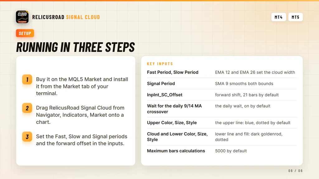
Where It Comes From
The projected band is one of the context layers in RelicusRoad Pro, published on its own for traders who want that single band and nothing else. It runs standalone and needs no other RelicusRoad product. If you would rather read trend as a line that flips sides, look at SuperTrend, and for the same question across nine timeframes at once there is Multi Timeframe Trendbar.
Support runs through the product comments and the mql5.com messaging system.
Frequently Asked Questions
Everything you need to know about RelicusRoad Signal Cloud. Still curious? Reach out anytime.
Learn How to Trade It
Every indicator ships with reference documentation and a matching strategy guide. You can also read what other traders say or start with the setup guide.
Indicator Reference
- Road Levels Dynamic S/R levels around a moving center line
- Support & Resistance Advanced S/R zones with alerts
- Action Levels Critical price levels for major moves
- Signal Lines Trend bias filter with two independent lines
- Daily High/Low/Open Daily extremes for range trading
- Daily Pivots Pro pivot points S1-S3, R1-R3
Trading Strategies
- Strategy #1: Price Action (Road) + SR + Trendlines + 2 TFs
- Strategy #2: Local Trendline + Price Position on Road + 2 TFs
- Strategy #3: Arrows + Price Action (Road) + SR
- Strategy #4: MicroScalping + Multiple Pairs + Daily Target 2-10%
Trading Guides
- Non-Repaint Forex Indicators: What 'Non-Repaint' Actually Means (and How to Verify It)
- Prop Firm Challenges: The 'Slow Boring' Strategy to Getting Funded
- Market Sessions Trading: How to Time the 'London-NY Overlap'
- What Is Forex Trading and How Does It Work?
- The Real Cost of Trading Platforms in 2026: A Broker-Neutral Teardown
- Position Sizing: The Boring Math That Keeps Traders Alive
- Forex Trading Psychology: 7 Traps and Process Fixes
Related tools
Single RelicusRoad indicators for MT4 and MT5, each one standalone.